Private prépa networkUI/UXSaaSFront-end dev2025
PrepaTutor
A social learning platform for classes préparatoires: the course, the timetable and the progress, in one place for students, teachers and staff.
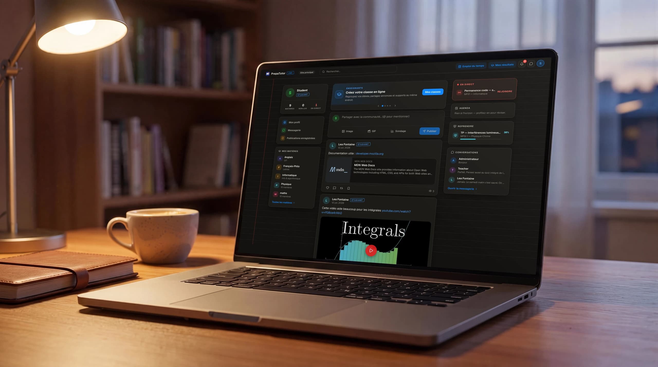
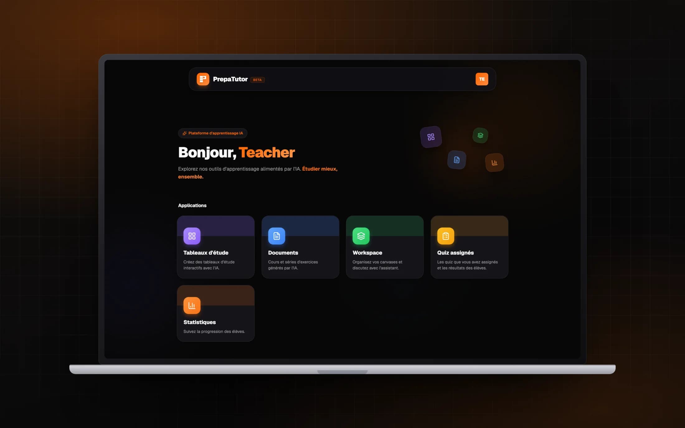
PrepaTutor is a learning platform built for the intensity of French classes préparatoires. It puts a social feed, video courses and live sessions, messaging, grades and a full academic back office behind one calm interface that adapts to six roles, from student to super-administrator. I led product and experience design across every surface, in light and dark.
01
The Problem
A prépa runs at a punishing pace, and the tools around it are scattered. The course lives in one place, the timetable in another, grades on paper, announcements in a group chat, and the students’ own back-channel somewhere the school never sees. Nothing talks to anything, and the people who need the whole picture, the staff, never quite have it.
The brief was one platform: something a student would open every day out of habit, that a teacher could run a class from, and that administration could steer the whole school with, without any of them feeling they were using the same heavy tool.
02
The Solution
PrepaTutor puts three products behind one interface: a social network where a promo lives, a learning space with video courses, live sessions and quizzes, and an academic back office that runs accounts, structure, timetables and report cards. What each person sees is shaped by their role.
The whole thing is wrapped in one visual language, a notebook you can theme, so a student’s feed and an administrator’s console feel like the same product, in light and dark.
Impact
- From student to super-administrator, one shell
- 6 roles
- A social feed, a learning space and a back office
- 3 surfaces
- Region-isolated campuses, steered from one console
- Multi-site
01Discovery
Before any screen, a map of the school
I started with how a prépa actually runs, because that is where the product would live or die. Following how information moved through a normal week kept surfacing the same picture: the course in one tool, the timetable on a printout, grades in spreadsheets, announcements in a group chat, and the real conversation in a student back-channel the school never sees. Nobody had the whole picture, least of all the staff.
Mapping who needed what exposed the harder problem. Six kinds of people would live in this product, and their days barely overlap: a student thinks in subjects and deadlines, a teacher in classes, a supervisor in attendance, administration in accounts, structure and report cards. Tuned to one of them, the platform would fail the other five.
Deep dive
So the first artifact of the project was not a screen but a table: every role against every surface, with three possible answers, full access, access scoped to their own, or not visible at all. Writing it down forced the sharp questions early. Does a supervisor see grades? Does a teacher see a colleague’s class? What does a super-administrator see across sites? Every navigation and permission decision made later traces back to this map.
| Feed | Subjects | Messages | Grades | Console | Sites | |
|---|---|---|---|---|---|---|
| Student | ||||||
| Teacher | ||||||
| Supervisor | ||||||
| Coordinator | ||||||
| Administrator | ||||||
| Super-admin |
02Framing
One product that behaves like three
The map pointed at a shape. Not one product stretched across six roles, but three products behind one shell: a social network where the promo lives, a learning space where the course happens, and a back office where the school is run. The shell, navigation, search and notifications, is identical for everyone; what it holds is assembled per role.
Three principles came out of framing and survived every review after it. Meet students inside patterns they already know. Make the subject, the matière, the unit everything hangs from. And let the role shape the surface, so nobody carries interface that is not theirs.
Deep dive
The obvious alternative, separate apps per audience, was rejected on a practical argument: a prépa is small and its people cross boundaries all day. A teacher answers a student in the feed, a coordinator teaches a class, an administrator posts an announcement. Splitting the product would have rebuilt exactly the walls the school wanted removed.
- Feed and composer
- Subject walls
- Direct messaging
- Member profiles
- Video courses and quizzes
- Live sessions
- Homework and materials
- Results and bulletins
- Accounts and roles
- Academic structure
- Timetables
- Report-card workflow
03Exploration
The home could have been three different products
The highest-stakes screen was the first one after login, because it silently decides what the platform is. I explored it in three directions: a dashboard that summarises your status, a portal that routes you to your tools, and a network feed that shows the life of the promo.
Paper walkthroughs killed the first two fast. The dashboard answers a question, what is my status, that nobody asks daily; it is the screen you open when something is due, exactly the usage pattern the school wanted to escape. The portal was honest but hollow, a corridor of doors with no reason to linger. The feed was the only direction where a student has a reason to come back between deadlines.
Deep dive
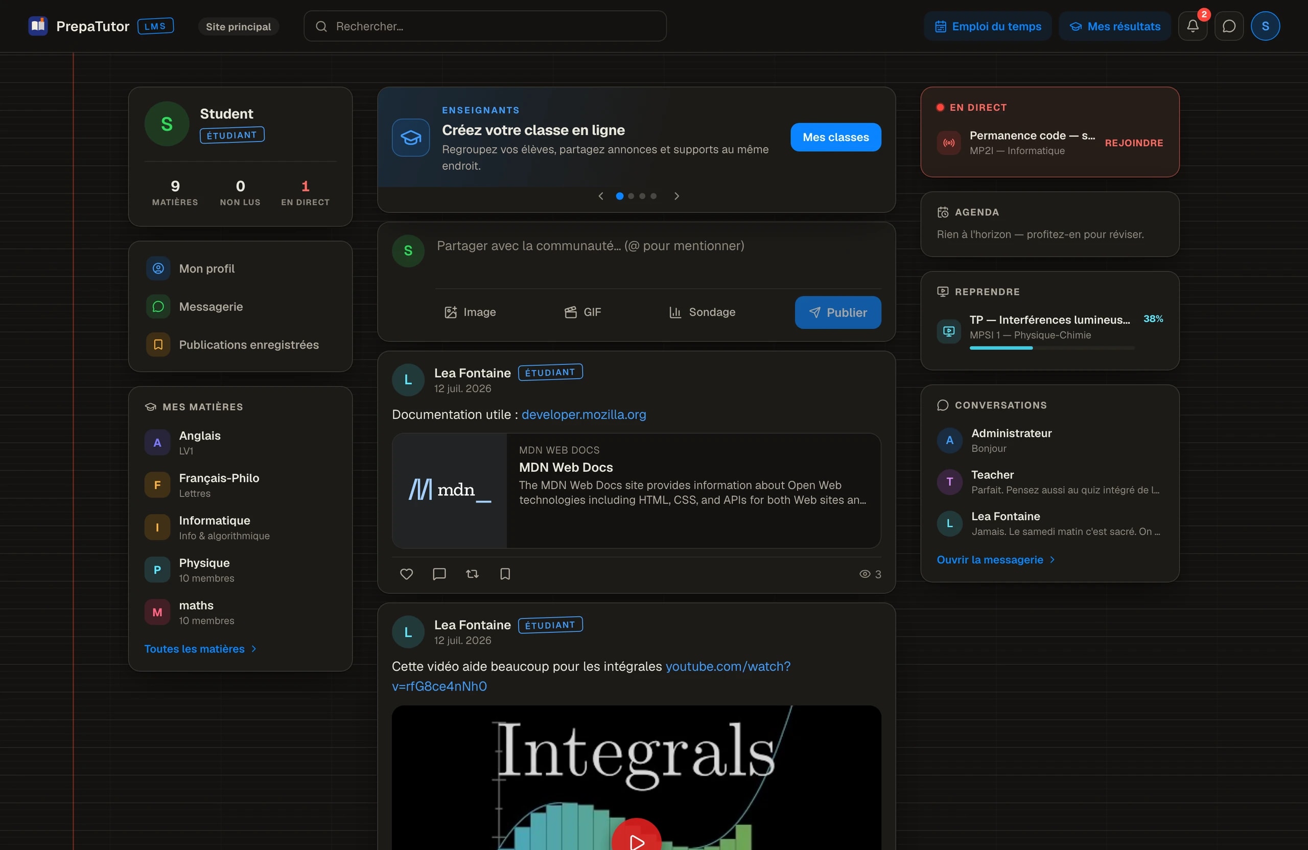
Choosing the feed then forced its own discipline, because a feed with nothing at stake decays into noise. The shipped home is a working feed: the composer on top, and a rail beside it carrying live sessions, the agenda and the courses to resume. Social first, with the day’s obligations always one glance away.
- Summarises status at a glance
- Opened only when something is due
- A tool, never a place
- Routes to tools, then empties
- No reason to linger or return
- The promo stays invisible
- The promo itself is the content
- Opened by habit, every day
- Duties stay in a side rail
04Community
Designing a promo, not an audience
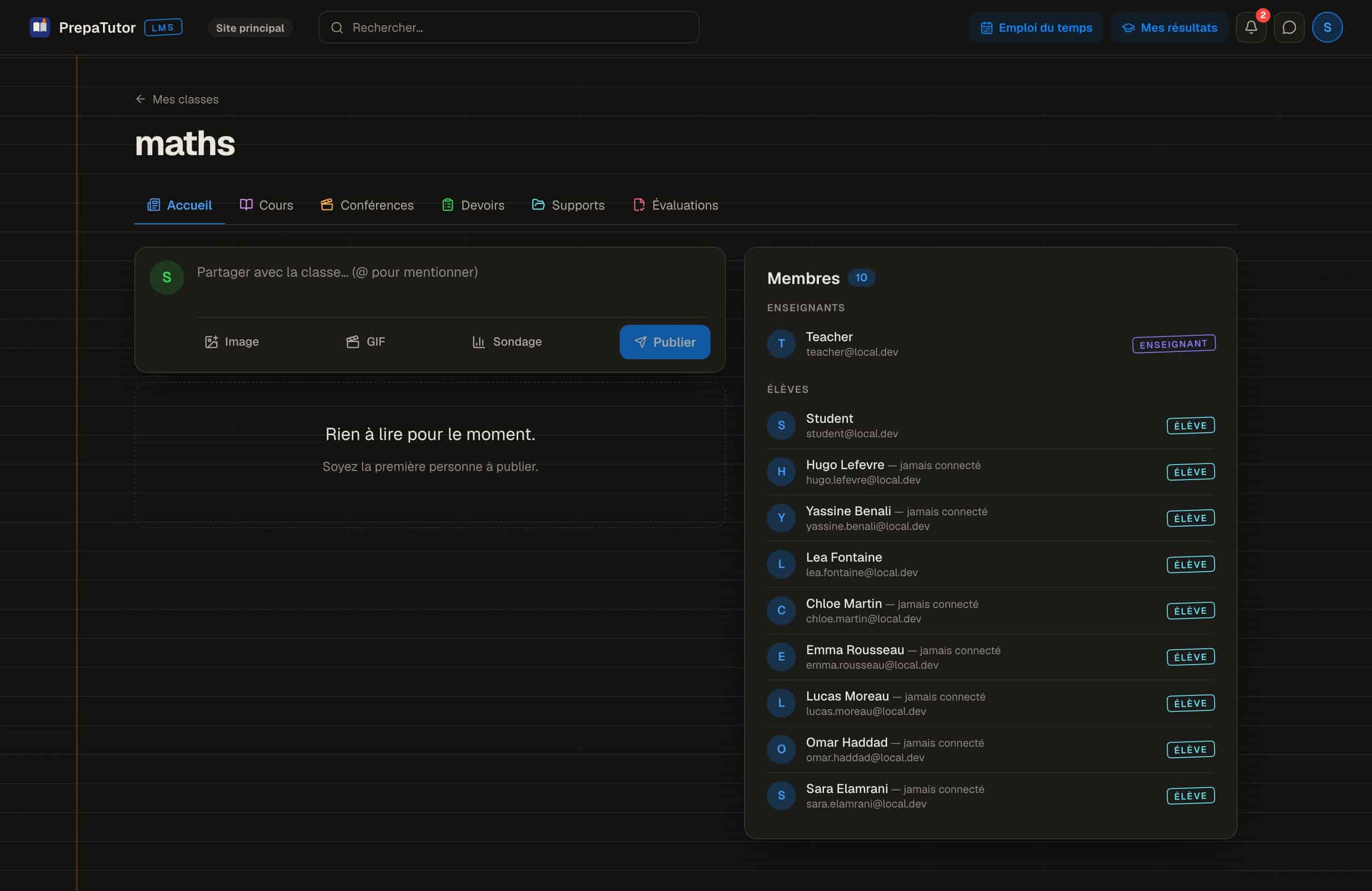
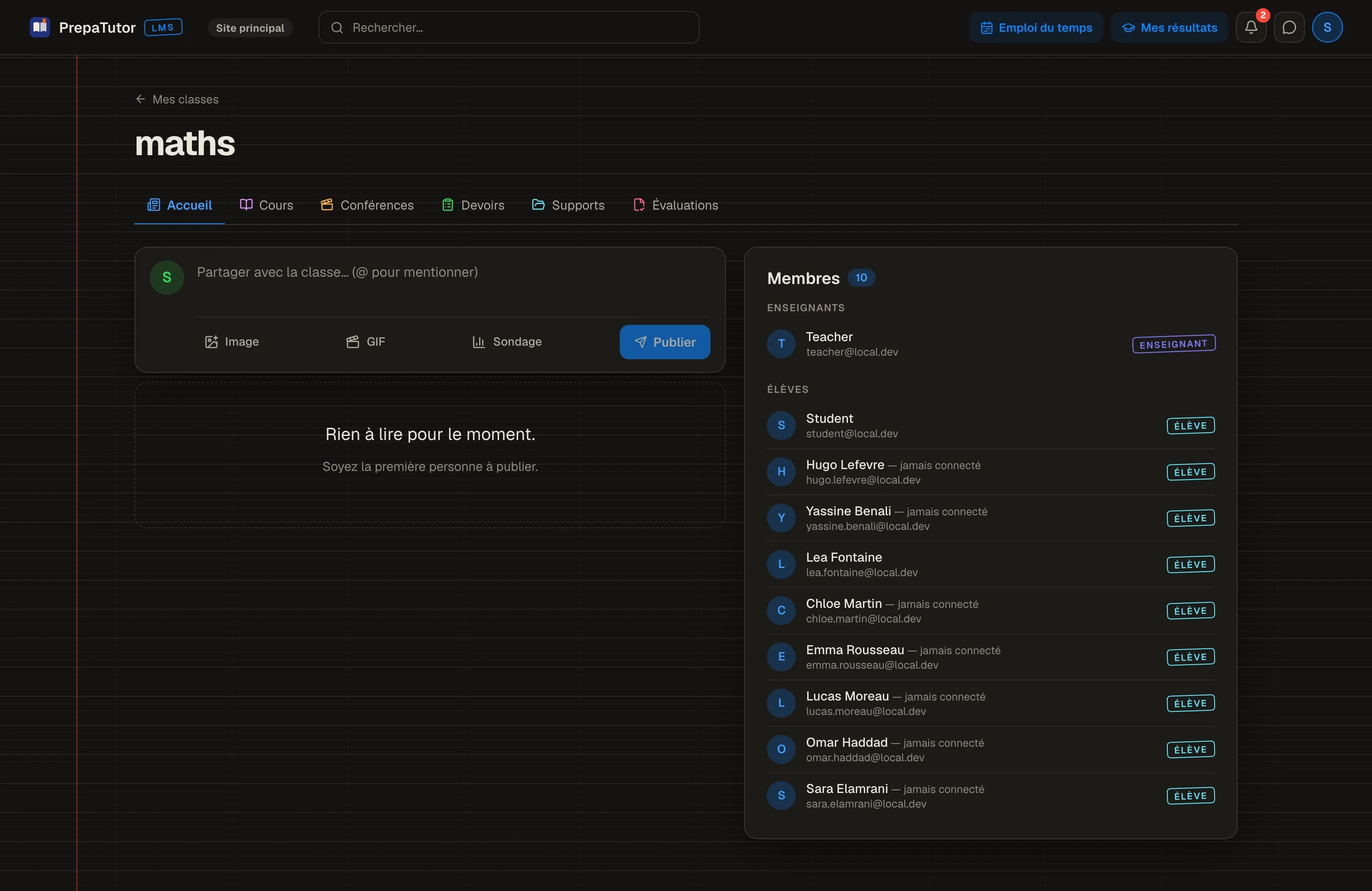
The social layer took the most iteration, because its failure mode was obvious from the start: one school-wide stream where a physics question drowns between announcements. The structure that worked splits conversation by scope. The whole-school feed carries life and announcements; each subject has a wall of its own where the class talks in context.
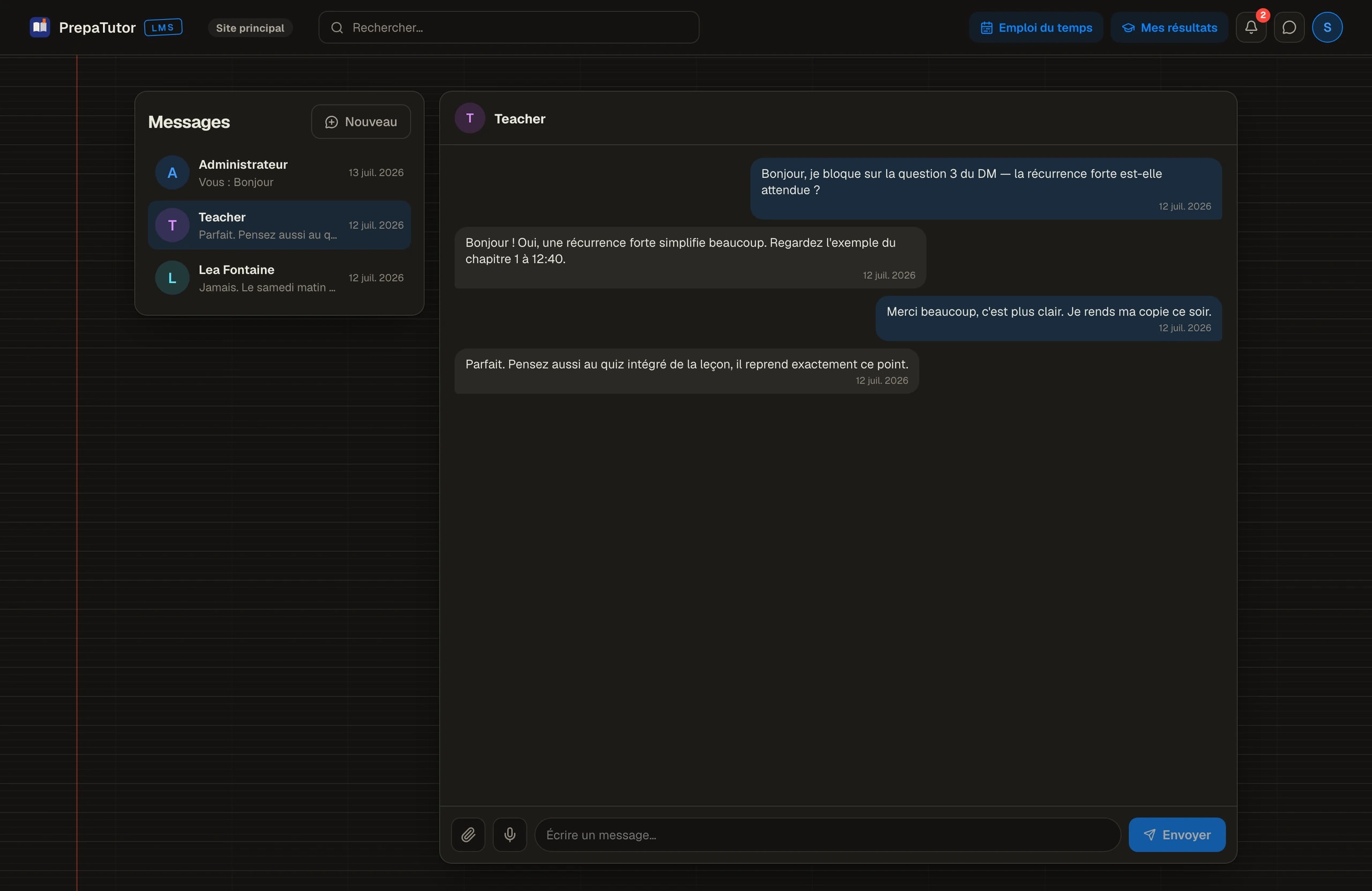
Messaging was the other fork in the road. A standalone chat would compete head-on with the group chat students already have, and lose. Placed inside the platform, one click from anywhere, it wins on the one thing a back-channel can never offer: a direct, in-context line to a teacher.
Deep dive
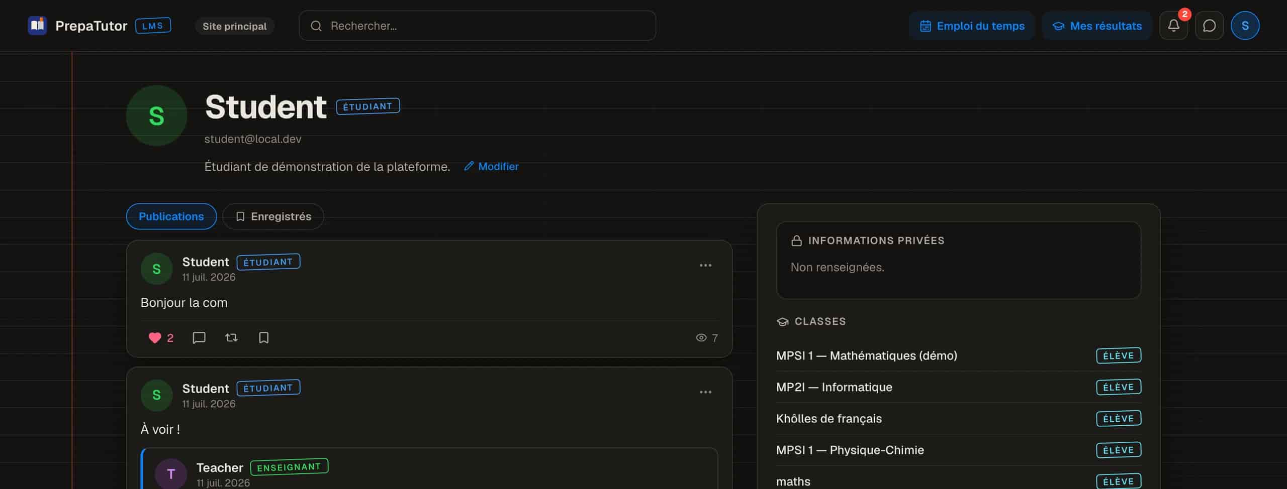
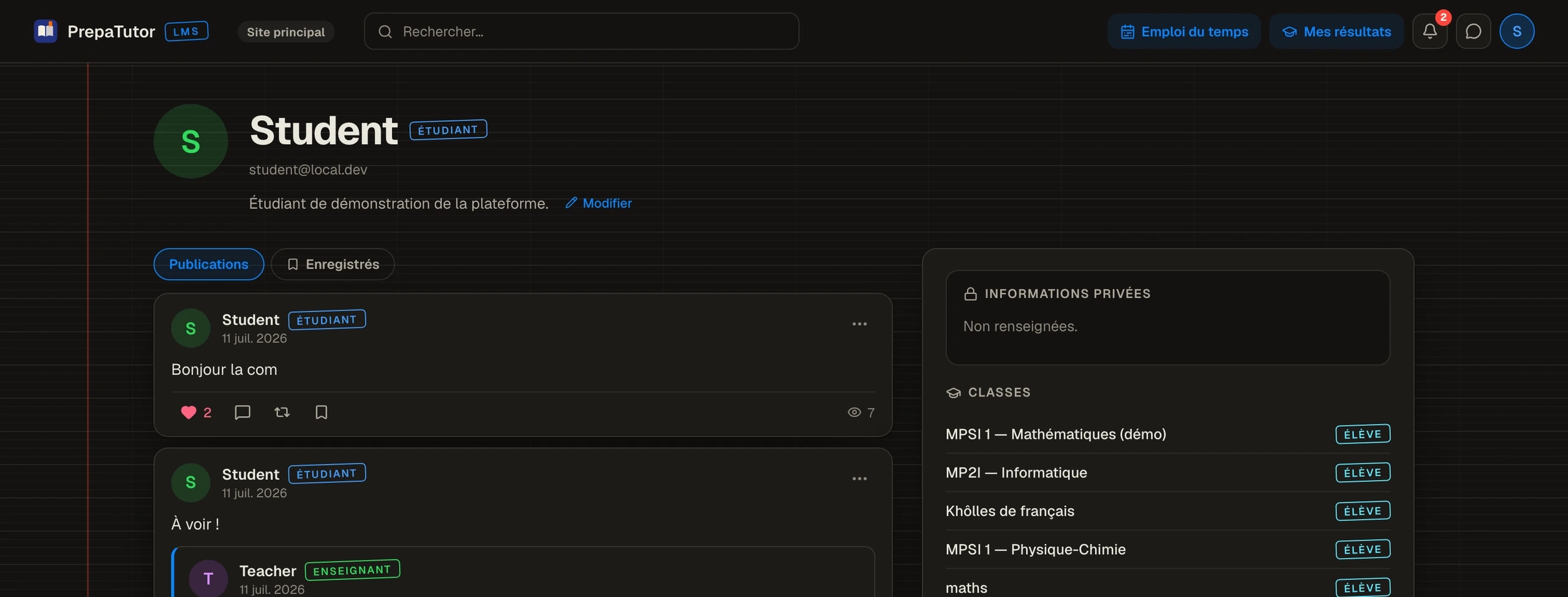
Profiles close the loop. Posts, saved items and the classes a person belongs to give every member a presence, so the promo reads as people rather than a roster. The small identity signals, avatars, mentions, reactions, do the quiet work of making participation feel seen and safe.
05Learning
The course, rebuilt around attention
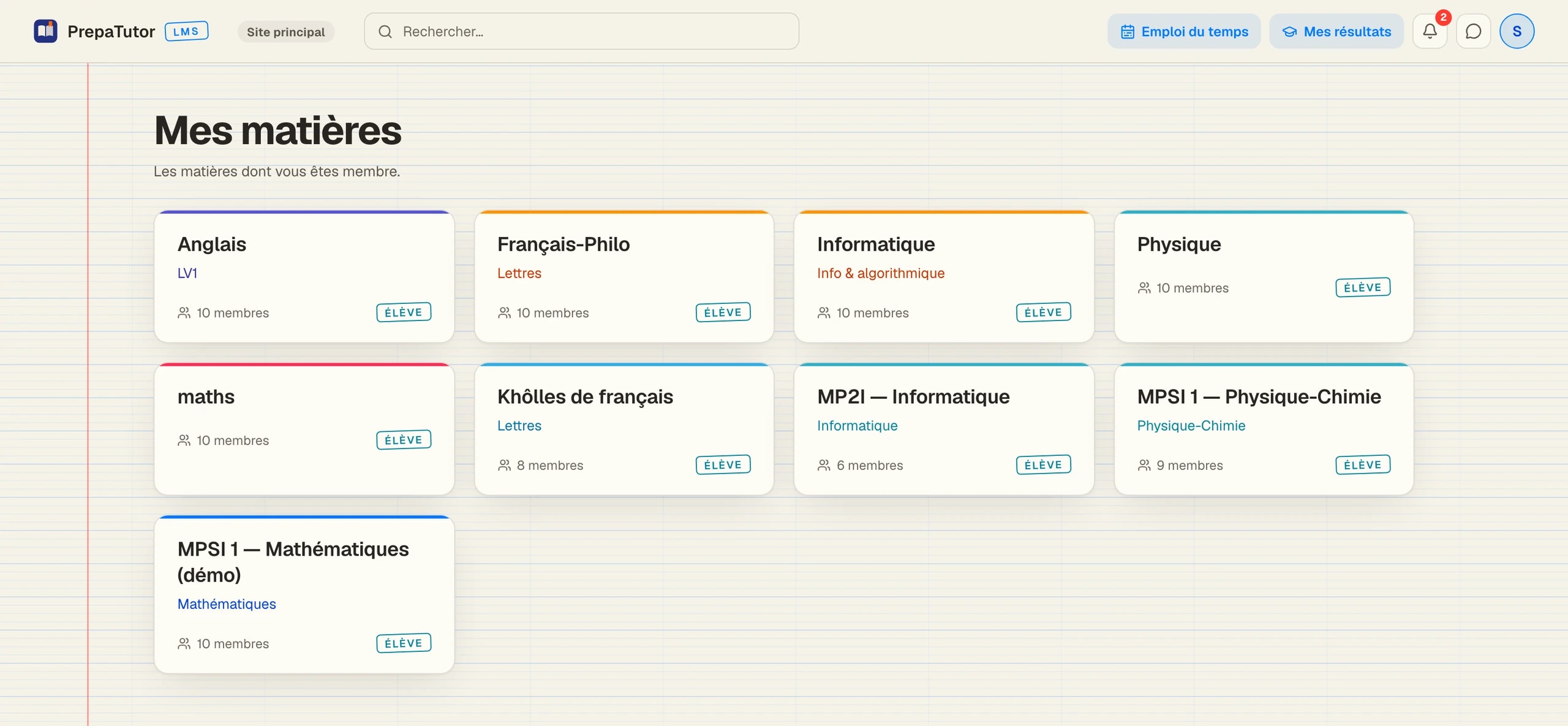
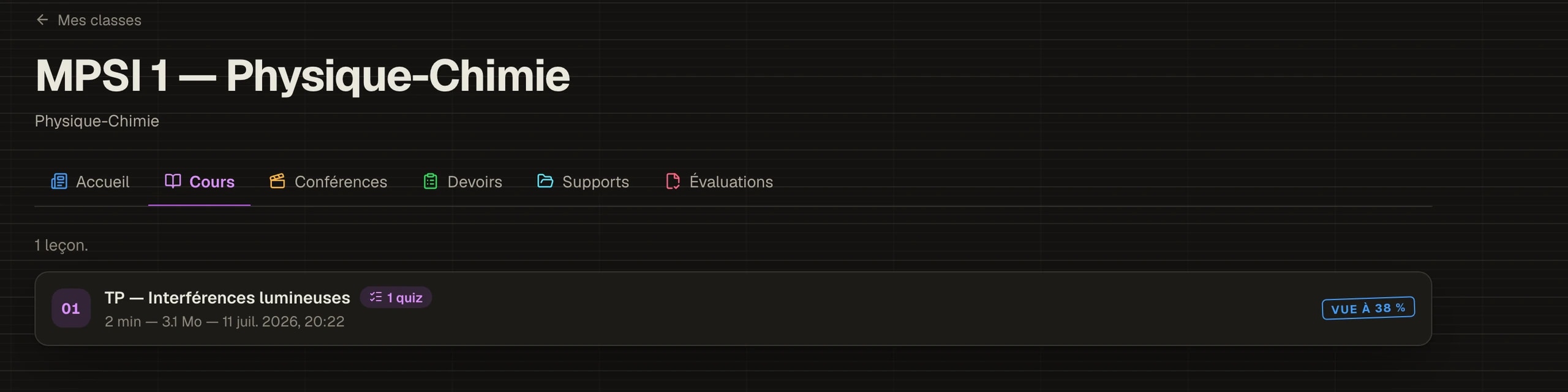
The first structure for a subject nested everything under a course tree, and it failed the simplest question a student asks: where is my homework? The shipped version flattens each subject into colour-coded tabs, wall, courses, conferences, homework, materials, assessments, so location is always one glance away.
A lesson plays as video with its quiz on the same page, and progress is tracked so a course resumes exactly where it stopped. The bet is pedagogical: checking understanding right after watching beats discovering the gap at the next colle.
Deep dive
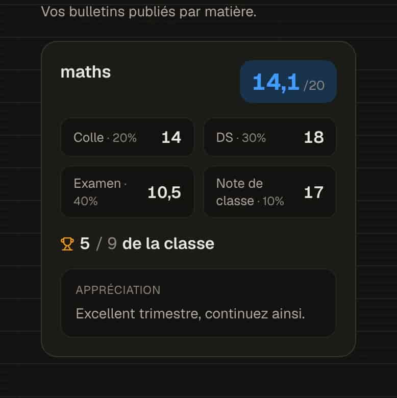
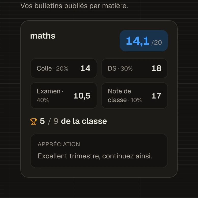
Results were designed from the school’s real arithmetic. A prépa grade is a weighted composite with a rank, and hiding that behind a single number would make the platform feel like it is withholding something. The results view shows the weighting, every component and the rank, with the teacher’s appraisal, so a bulletin explains itself the way the school computes it.


06Administration
The machine room, designed like a product
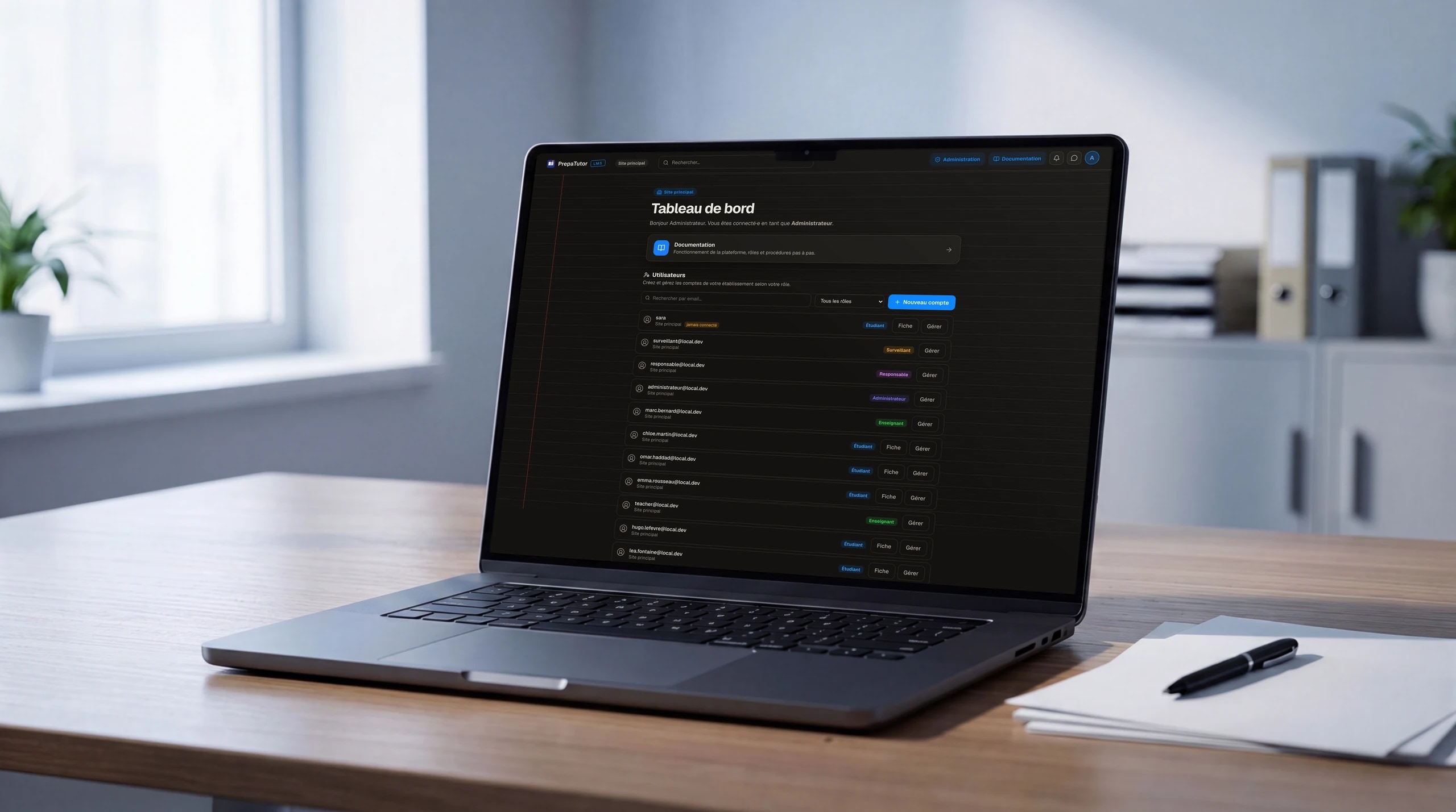
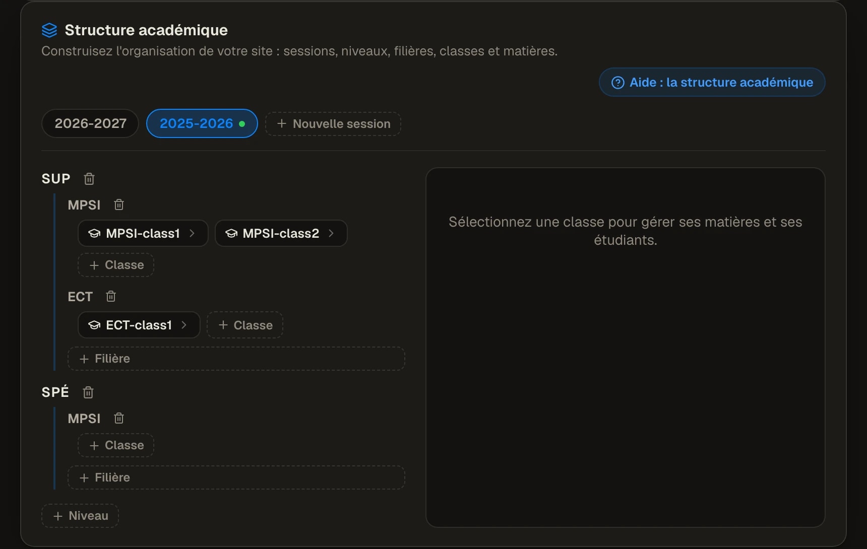
The back office got the same design attention as the student surfaces, on one argument: if staff cannot run the school from it, they fall back to spreadsheets and the platform dies from the inside. So administration is a real product: accounts and roles, a visual builder for the academic structure, timetables, and report cards run as a workflow.
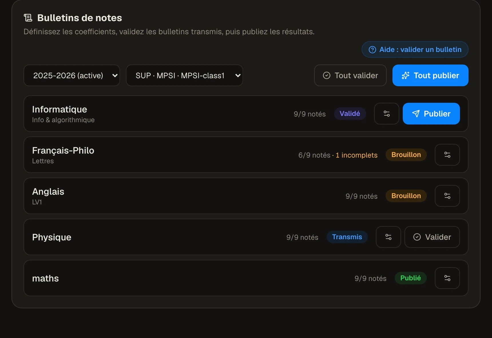
The report-card pipeline is the clearest case of designing a process rather than a screen. Grades used to travel as files, with every risk that implies. Here a bulletin moves through four states, draft, submitted, validated, published, and a student can only ever see the last one. The state is visible at every step, so responsibility is never ambiguous.
Deep dive
Scale shaped the console too. An administrator lives inside one site; a super-administrator works across region-isolated sites, each a fully separate space. And because the console is used a few times a term rather than daily, it leans on recognition over memory: a role-aware documentation base explains every screen where it stands.
- DraftTeacherGrades are entered per subject and can still change freely.
- SubmittedTeacherThe subject is handed over for review; edits now leave a trace.
- ValidatedCoordinatorThe pedagogical lead checks the class and signs it off.
- PublishedAdministrationOnly now does the bulletin reach the student.
07Craft
A notebook you can theme
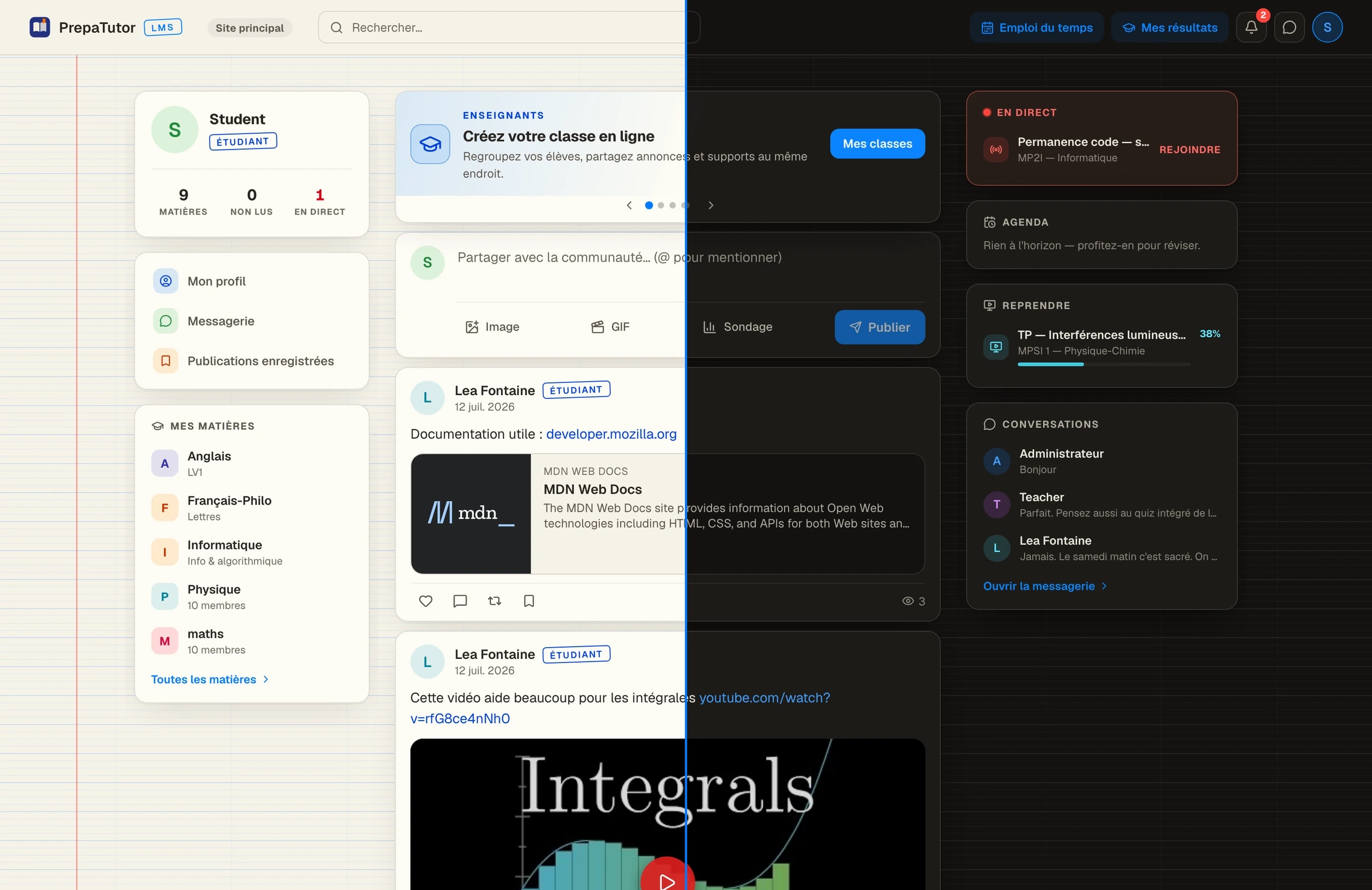
The identity question was how to make a serious school product feel owned by eighteen-year-olds without dressing it as a toy. The safe route, generic edtech illustration, would have aged in a season. The direction that stuck came from the desk itself: a notebook. A warm paper ground, a faint rule, a red margin line. School, said structurally, without a single illustration.
Colour is a system with jobs. One electric blue carries every action and nothing else; each role and each subject holds a fixed colour, so the interface stays legible as it fills up. Both themes come from a single token set, designed together from day one, so dark is a native mode rather than an inverted afterthought.
Deep dive
Dark mode was the test of the metaphor. The notebook survives there as texture rather than whiteness: the rule and the margin stay, the paper warms down to near-black. An identity that only works in light mode is a poster; this one had to be a system.
08Reflection
What shipped, and what it settled
PrepaTutor shipped as one platform carrying three products, six roles and two themes, across region-isolated sites. The measure I care most about is quieter than a launch: the school’s official life and the promo’s daily life now happen in the same place, which is the one thing the scattered tools could never do.
The lasting lesson is about order. The access map and the home exploration, both made before any polished screen, did more for the final quality than any amount of visual iteration afterwards. On a product like this, process is not overhead; it is where the product is actually decided.