MedVis AIUI/UXBrandingFramer2025
MedVis AI
Reading radiology, accelerated. A diagnostic-AI brand and landing page built for clinical trust.

MedVis AI helps radiologists read medical imaging faster, turning a scan into explainable, high-confidence insight in seconds. It needed an identity and a landing page that earn a clinician’s trust on sight: modern enough to feel innovative, disciplined enough to feel safe. I built the brand from the mark up and shipped the site in Framer.
01
The Problem
Radiology software lives or dies on trust. MedVis had a genuinely useful product, reading imaging faster with explainable results, but no identity to carry it and no landing page to earn a clinician’s confidence.
The challenge was tonal. Healthcare rewards restraint; an AI product needs to feel modern. Too clinical reads as dated, too futuristic reads as unproven.
02
The Solution
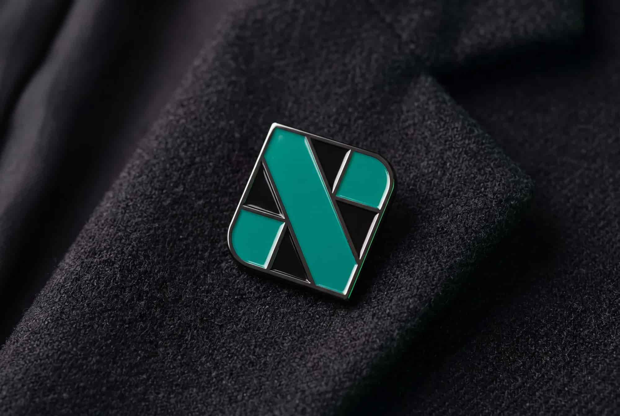
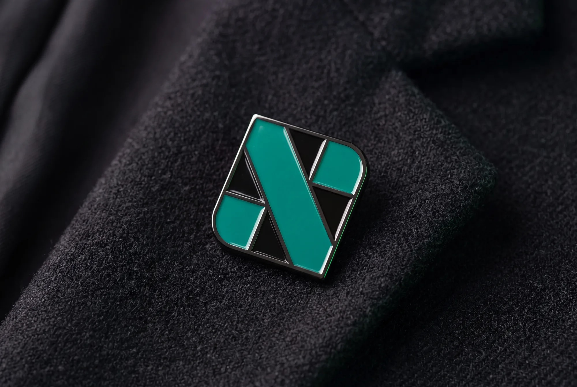
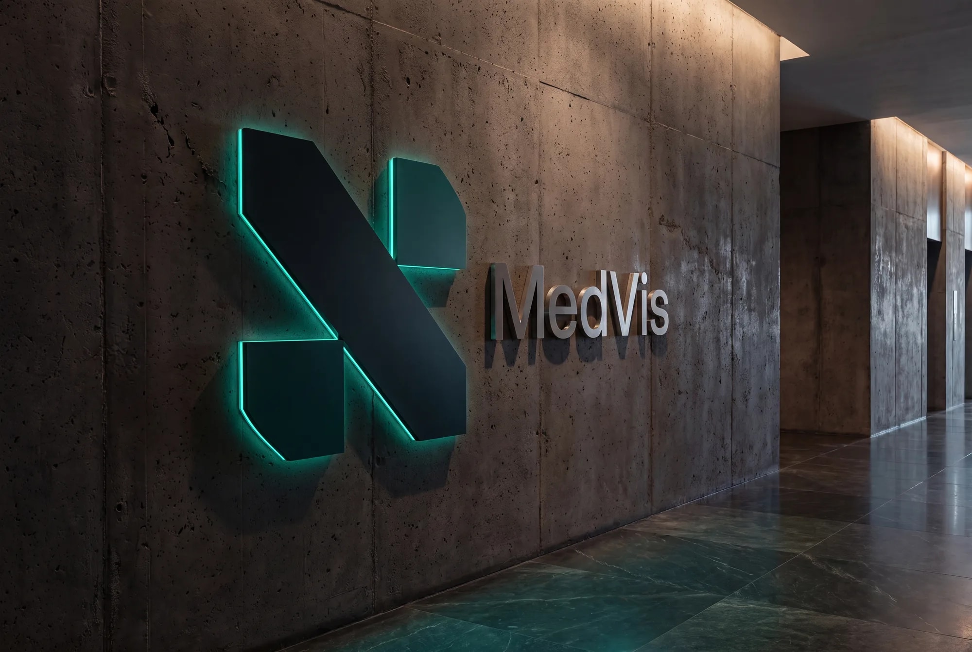
I built the identity from the machine itself: a mark abstracted from an MRI scanner, one signal green on a dark reading-room canvas, and a single expanded typeface.
The landing page leads with the outcome, then shows the interface, explains the process, and answers the buyer’s objections.
Impact
- Identity built from the mark up
- End-to-end
- Landing page designed & shipped
- Framer
- One signal green, reading-room dark
- 5 colours
01Discovery
Trust is the product
MedVis came with a working product and no face. Discovery was mostly listening for what a radiologist would need to believe before letting an AI near a scan, and it kept returning to one word: trust. Radiology software is judged in seconds, and it is judged tonally before it is judged functionally.
That put the identity on a ridge with two slopes. Healthcare rewards restraint, so too futuristic reads as unproven; an AI product has to feel current, so too clinical reads as dated. Every decision after was a test against both failure modes at once.
Deep dive
The audience set the register. The buyer is a clinician, not a consumer, and clinicians trust instruments, the machines they already work with, more than they trust brands. That observation became the seed of the mark.
02Exploration
Three routes to a medical mark
I explored the three classic identity routes. The literal route, a medical cross or a scan pictogram, is safe, instantly readable and owned by nobody, which means it is owned by everybody. The letterform route, a drawn M, is ownable but says nothing about what the product does. The third route abstracts the machine itself: an MRI scanner reduced to its magnet poles and the patient bed between them.
The machine route won because it works on both slopes of the ridge at once. A radiologist reads the geometry as equipment, which grounds the AI in something trusted; everyone else reads a sharp, modern mark; and at a glance the diagonals resolve into an implied medical cross, so the literal route’s instant readability comes along for free.
- A cross or scan, read instantly
- Owned by every clinic on earth
- Says nothing about MedVis
- Ownable and compact
- Silent about the product
- Modern, but generic tech
- An MRI reduced to its geometry
- Reads as instrument, then as cross
- Ownable and specific at once
- MRI magnetsThe two triangles are the magnet poles of an MRI bore, grounding the mark in the real machine.
- Patient bed & scan axisThe bold diagonal is the bed through the bore, and the axis MedVis reads along.
- Sharp geometryEvery edge is cut on a 45° grid. Precision that also forms an implied medical cross.
03Brand system
One green, a reading room, one voice
The rest of the system runs on the same restraint. One signal green is the only accent, on a canvas taken from the room the product lives in: the dimmed radiology reading room. In that room green means a confident, finished result, so the colour is never spent on decoration.
Type follows the same logic: Zalando Sans Expanded across display, wordmark and body. One expanded face keeps a small brand feeling deliberate and instrument-like, and one voice is one fewer thing for a sceptical reader to doubt.
abcdefghijklmnopqrstuvwxyz 0123456789 & @ %
04Framer landing page
A page ordered like an argument
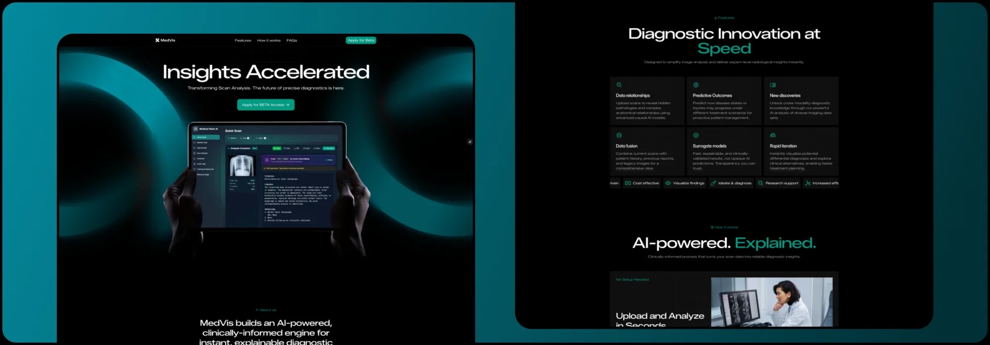
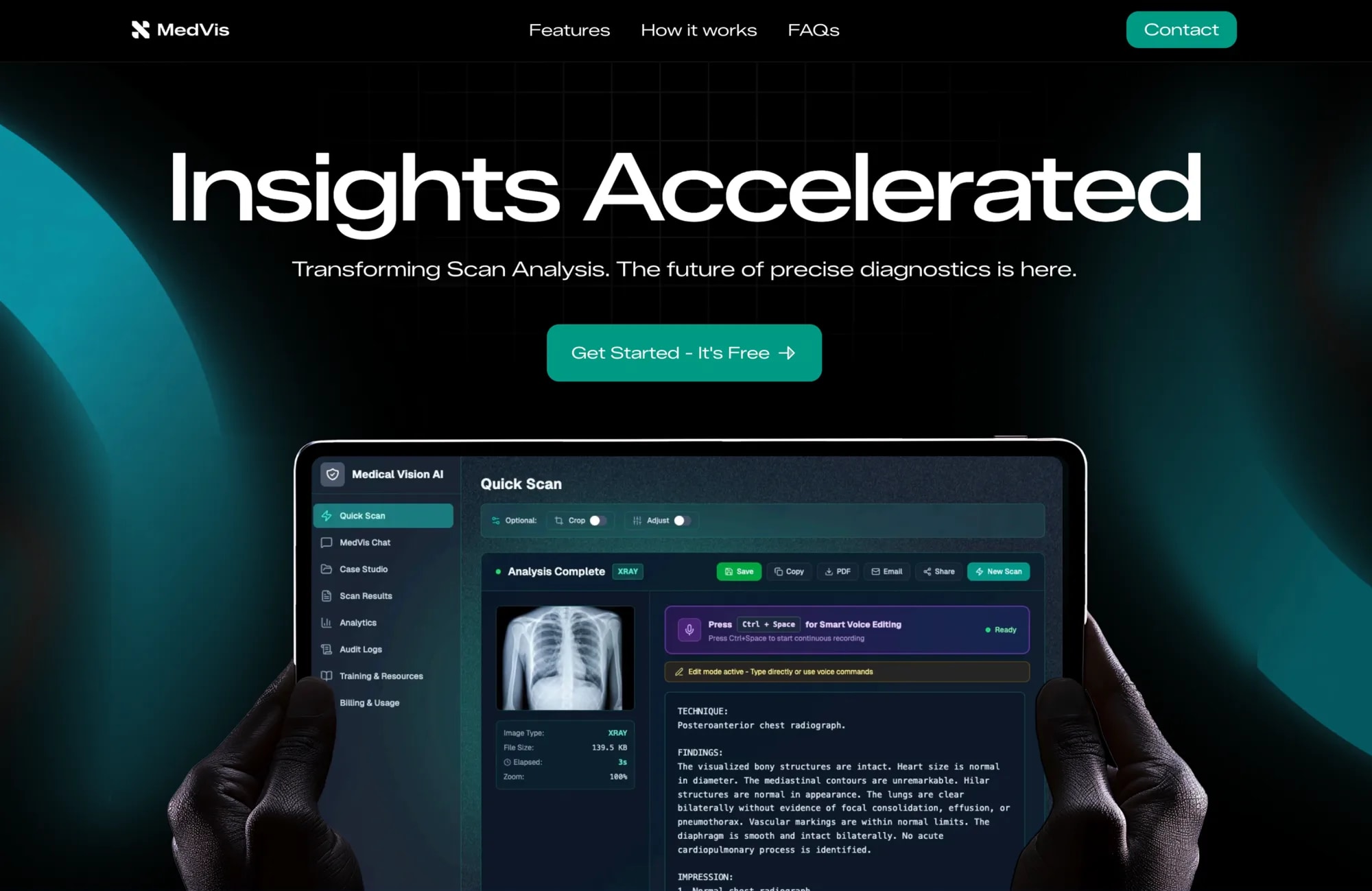
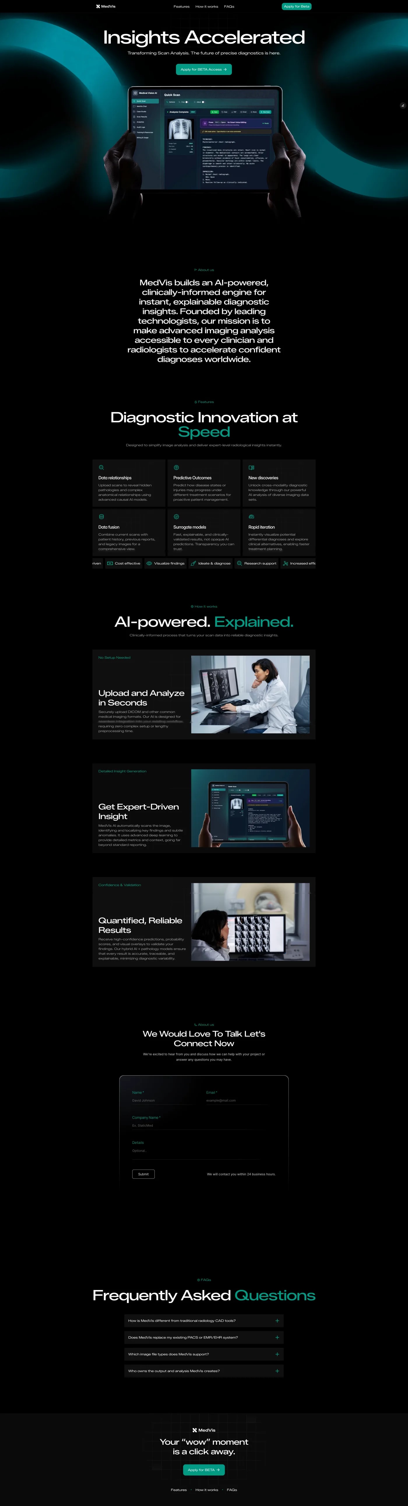
The site has one job: convince a sceptical clinician, fast. So the page is structured as an argument rather than a tour. It leads with the outcome, “Insights Accelerated”, and puts a real scan-analysis interface in the first viewport, because showing the product working is the fastest way to make the claim believable.
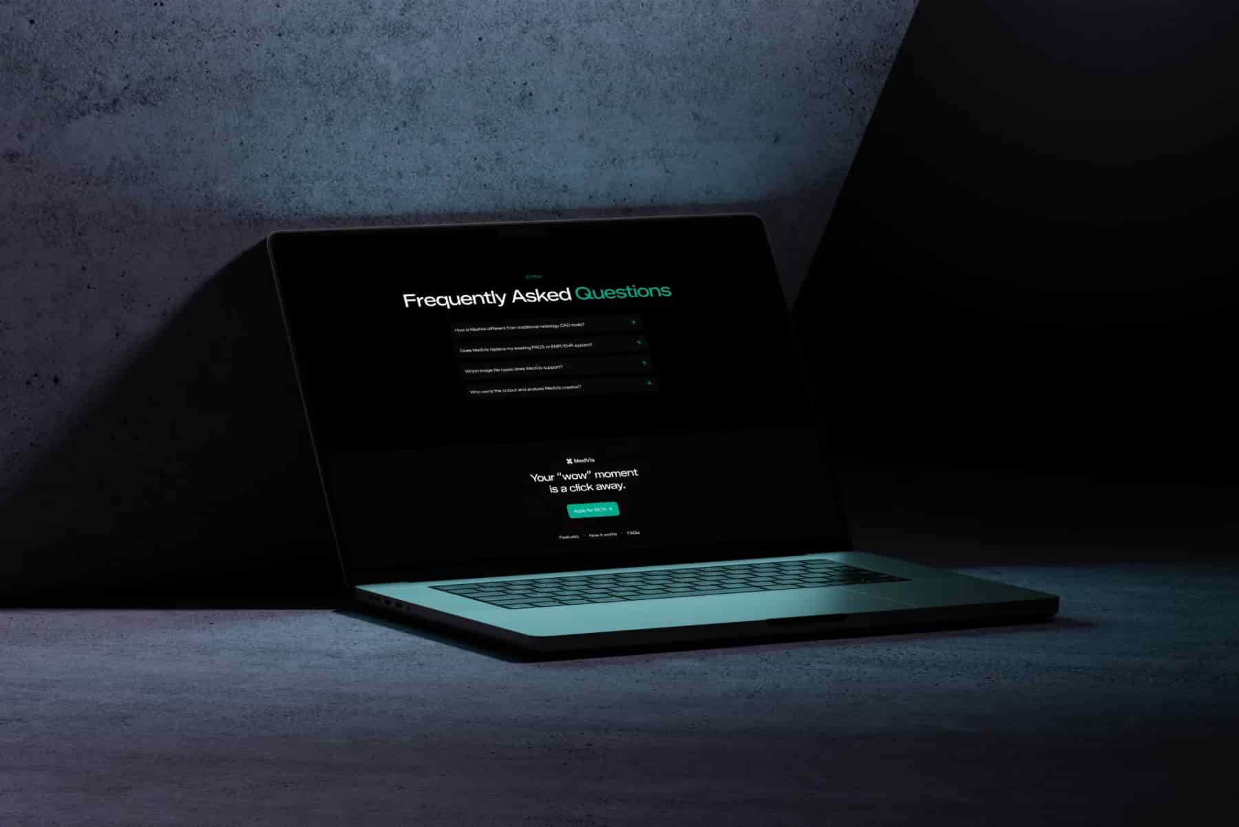
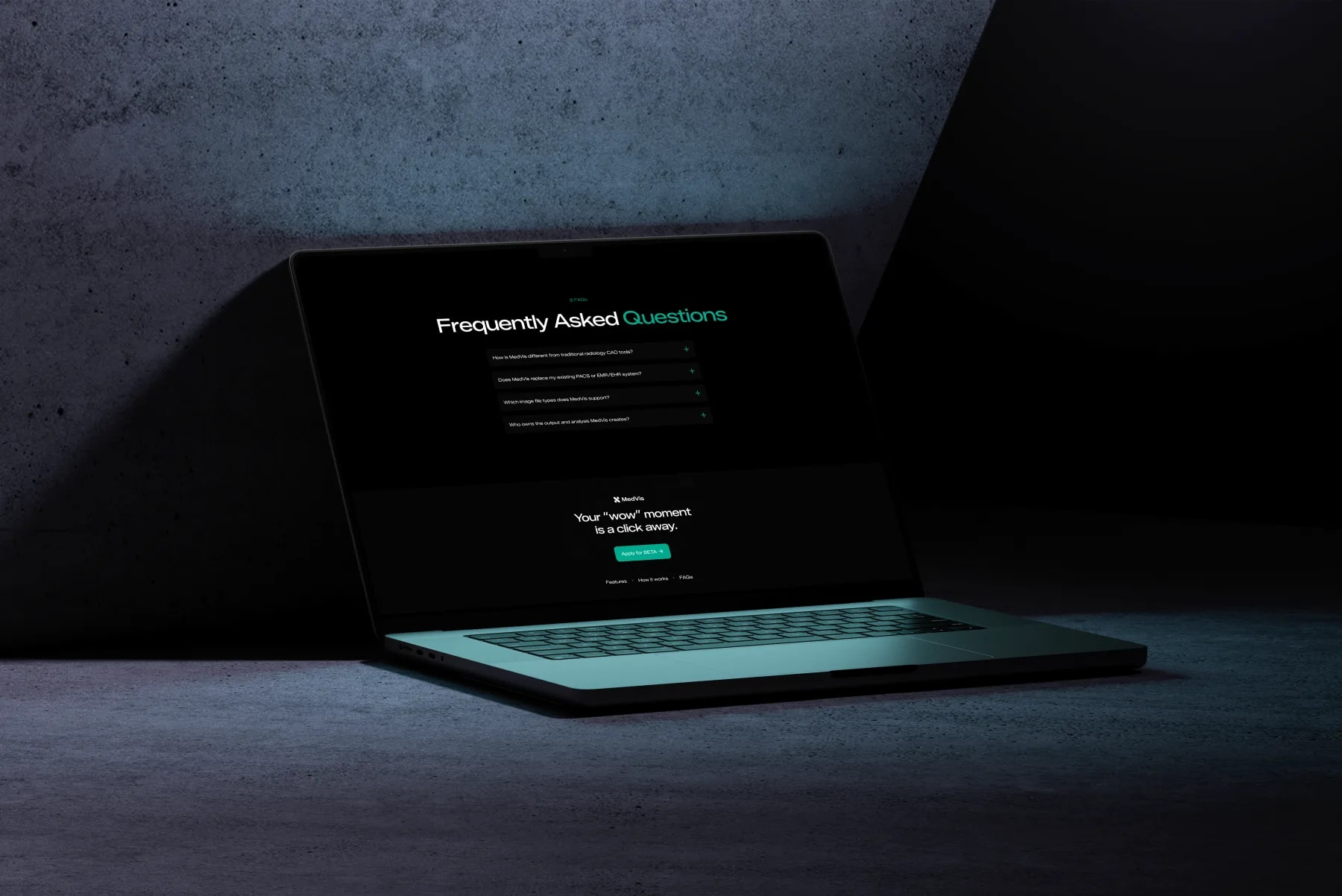
From there, each section removes one reason to hesitate, in the order a clinician raises them: see the interface, understand the process (“AI-powered. Explained.”), quantify the confidence, then answer the real blockers in the FAQ, PACS and EMR integration, file formats, data ownership. Designed and shipped in Framer.
- Navigation · Wordmark, section anchors and a persistent Contact CTA.
- Hero, “Insights Accelerated” · The core promise plus a live product preview in hand.
- About · One line on the mission: democratising imaging analysis.
- Features, “Diagnostic Innovation at Speed” · A six-card grid of product capabilities.
- How it works, “AI-powered. Explained.” · Three steps: upload, insight, quantified result.
- Contact · A short form: let’s connect now.
- FAQs · Four objection-handlers on integration and data.
- Footer CTA · A last call to apply for beta.


05Reflection
What a trust-first brand settled
MedVis shipped with an identity built from the machine up and a landing page ordered like an argument, designed and delivered in Framer. The work that mattered most never shows in the deliverables: naming the two ways the brand could fail, dated or unproven, before drawing anything.
The lesson I keep is that in clinical products, trust is not a section of the page or a value in a deck; it is the constraint every decision answers to. A mark borrowed from the equipment, a colour that only ever means cleared, a page that answers objections in order: each is the same sentence said three ways.