JISABI TechnologyUI/UXBrandingFramer2025
JISABI TECH
A logo, identity, and Framer site for an AI-powered digital-transformation platform built for Industry 4.0.
JISABI is a Moroccan technology company helping industries move toward smarter, more efficient operations: AI-powered dashboards, predictive analytics, IoT systems, digital twins, and intelligent automation. It needed a full presence: a logo and identity that read as advanced and trustworthy, and a website that makes a dense technical offer feel clear, credible, and modern. I built the brand from the mark up and shipped the site in Framer.
01
The Problem
JISABI’s offer is deep and technical: predictive analytics, IoT systems, digital twins, intelligent automation for Industry 4.0. Two things were missing: an identity to carry it, and a website that communicates value instead of listing capabilities, so a serious industrial buyer understands what JISABI actually does for them.
The brand also had to feel genuinely modern. Industrial-technology companies often look dated; JISABI wanted a logo and a digital presence that matched the sophistication of the technology itself.
02
The Solution
I built the identity from the ground up (a logo, an ember-orange palette on a dark canvas, and a type system), designed to read as advanced and precise without tipping into gimmick.
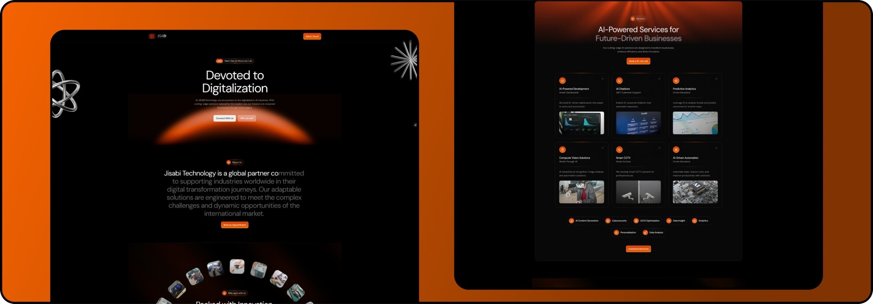
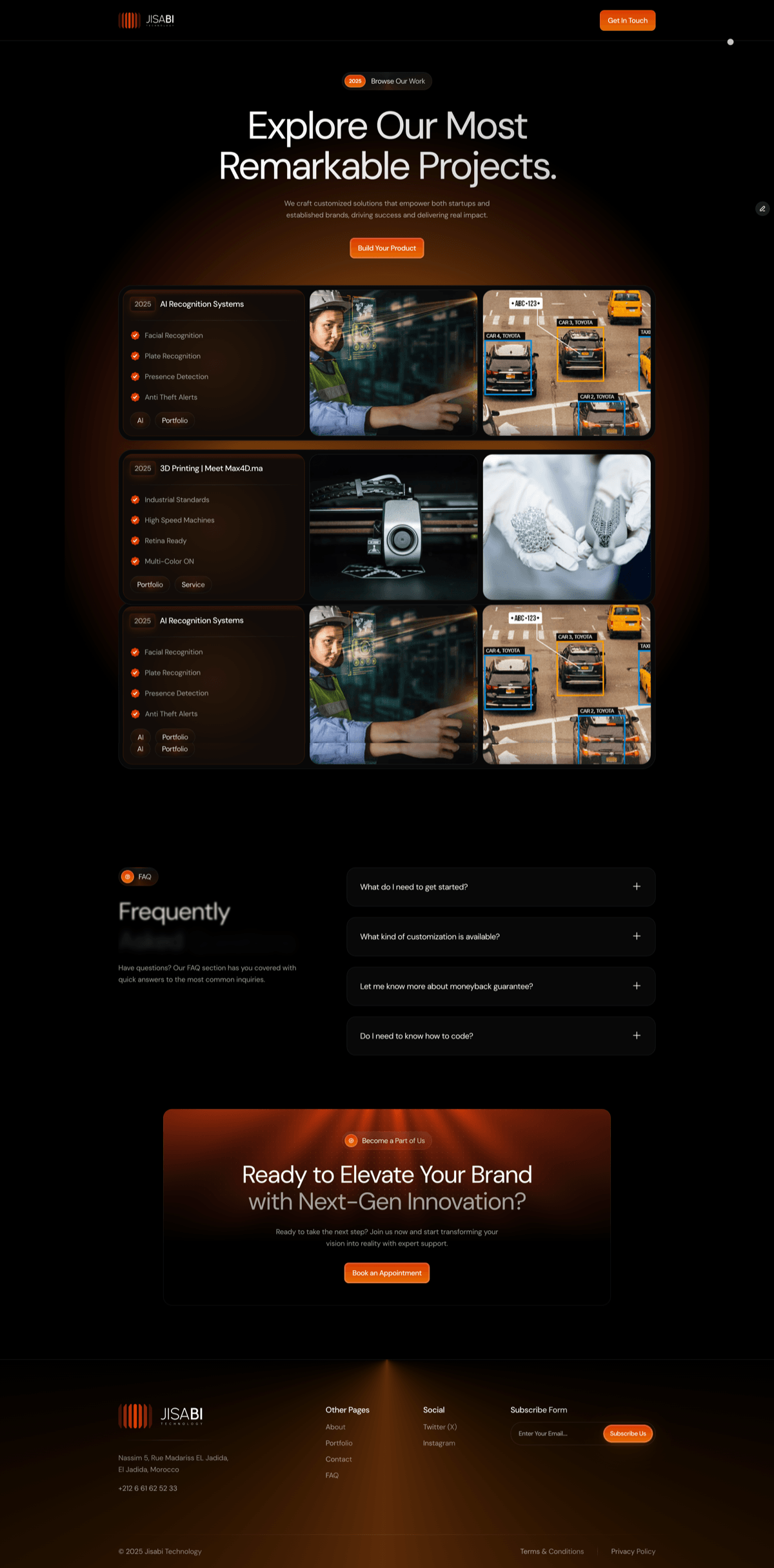
Then I designed and built the site in Framer around modern UI/UX principles: smooth motion, responsive layouts, strong typography, and restrained futuristic detail. Structure carries the message: services like AI dashboards and digital twins are framed by the operational outcomes they enable, so value lands before the technical detail.
Impact
- Logo, identity & website
- End-to-end
- Designed & developed, no-code
- Framer
- Positioned for industrial buyers
- Industry 4.0
01Discovery
A modern face for heavy industry
JISABI sells deep technology to a conservative audience: predictive analytics, IoT, digital twins and automation, bought by industrial operators who have watched a hundred vendors overpromise. Discovery kept circling one gap: the sector’s brands either look dated, which undercuts an innovation story, or look like science fiction, which undercuts trust.
The second gap was the message. The offer was being told as a list of capabilities, and an industrial buyer does not buy capabilities; they buy uptime, efficiency and fewer surprises. Whatever the site would look like, its structure had to translate technology into operational outcome first.
02Exploration
Three routes to the mark
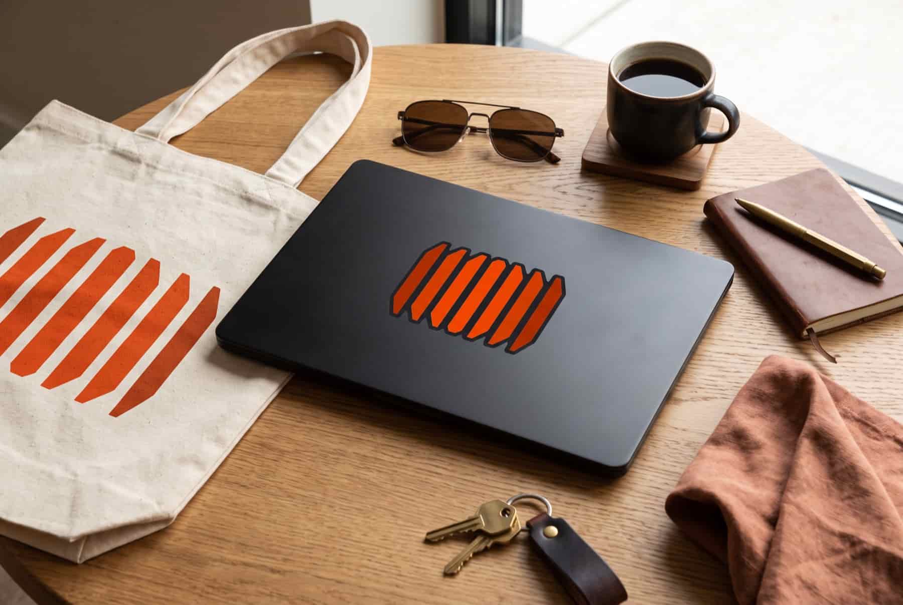
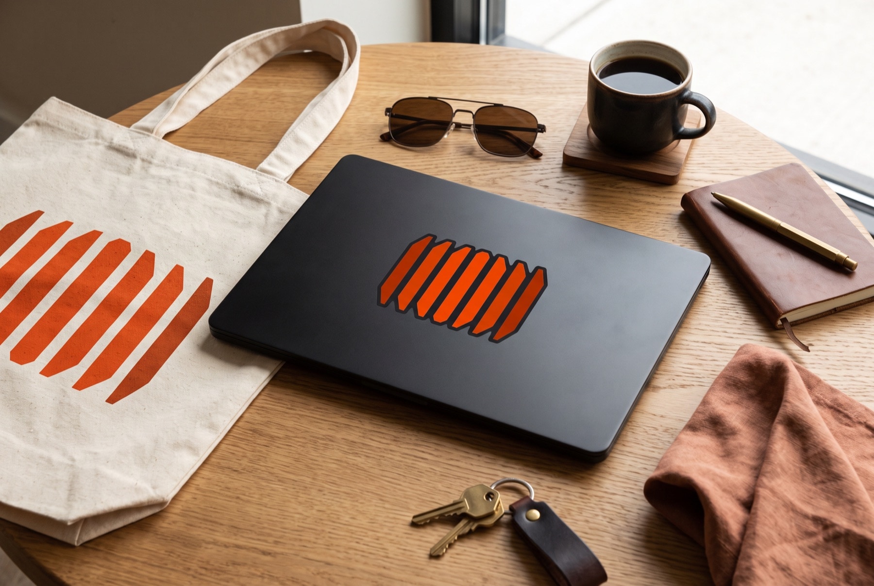
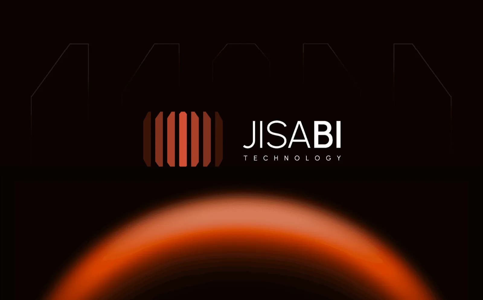
I ran the mark through the three classic routes. The literal route, a gear, a circuit, a factory pictogram, describes the industry and disappears into it. The letterform route, a drawn J, is compact and ownable but mute about motion, and momentum was the one idea the strategy insisted on. The abstract route won: a symmetric fan of seven tapered blades, tallest at the centre, fading outward.
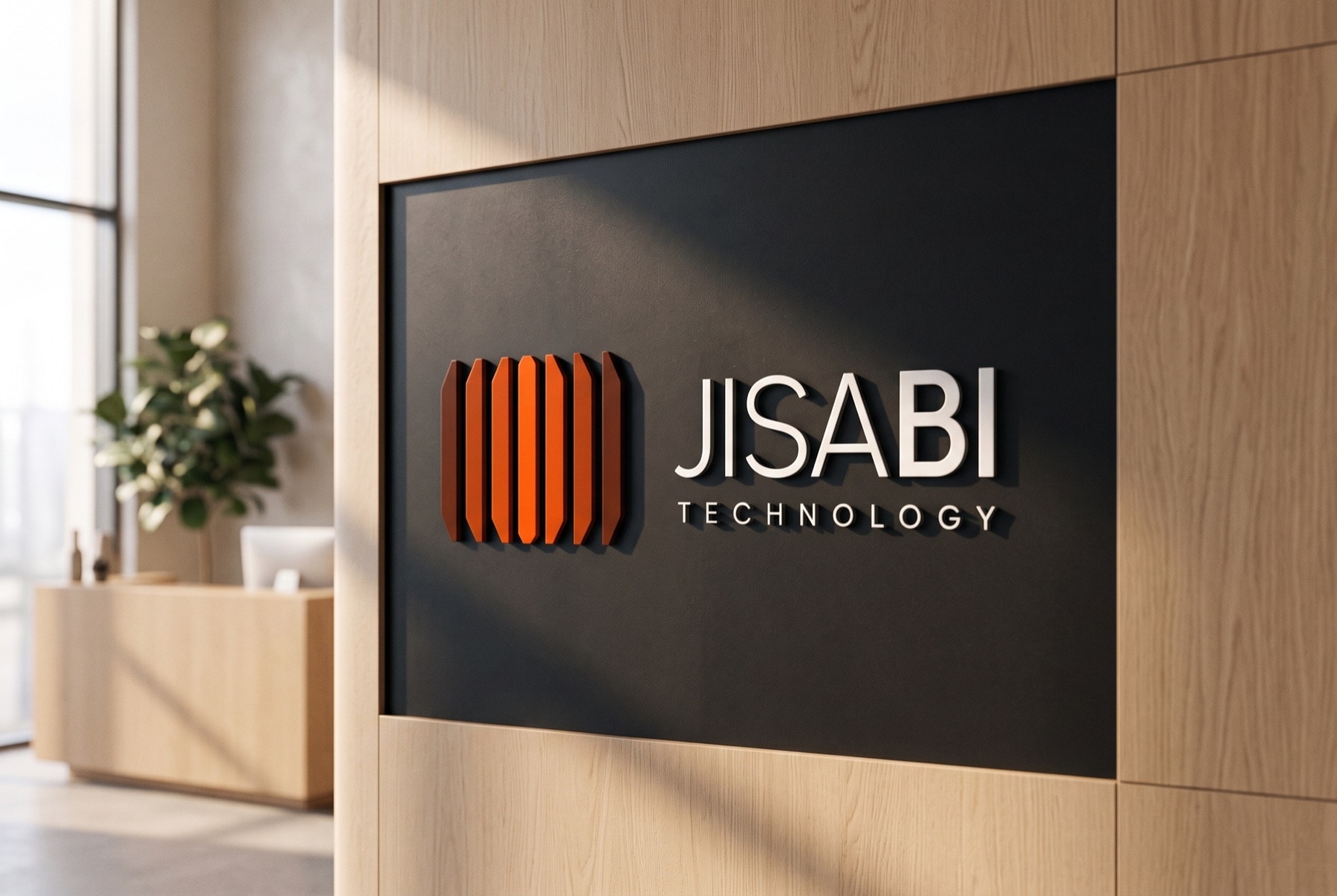
The fan earns its place by saying something specific. Blades stepping down and fading outward read as signal radiating from a centre: systems in motion, momentum toward smarter operations. It is balanced enough to feel stable, sharp enough to feel engineered, and it survives every size from favicon to facade.
- A gear or circuit, read instantly
- Describes the sector, not JISABI
- Ages as fast as the industry look
- Compact and ownable
- Mute about motion and signal
- Generic tech register
- Momentum and signal, drawn
- Stable, engineered geometry
- Holds from favicon to facade
- Mirror symmetryA tall central blade is flanked by mirrored pairs stepping down on each side: a balanced, stable mark that reads the same from either direction.
- Tapered bladesEach blade is cut to a point top and bottom, so the mark feels sharp and precise: engineered, like the platform behind it.
- Fading outwardOpacity steps down toward the edges, so the fan reads as motion and signal radiating out: momentum toward smarter operations.


03Brand system
Ember on carbon
Around the mark sits a tight system: ember orange as the single accent on a near-black canvas, a geometric grotesk for display against a neutral grotesk for body, and restrained warm glows that suggest live data without turning the brand into a sci-fi cliché.
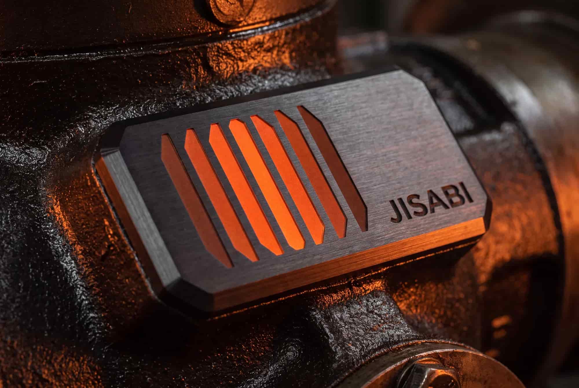
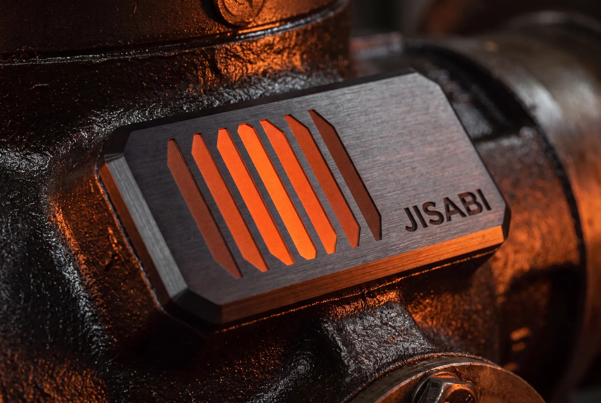
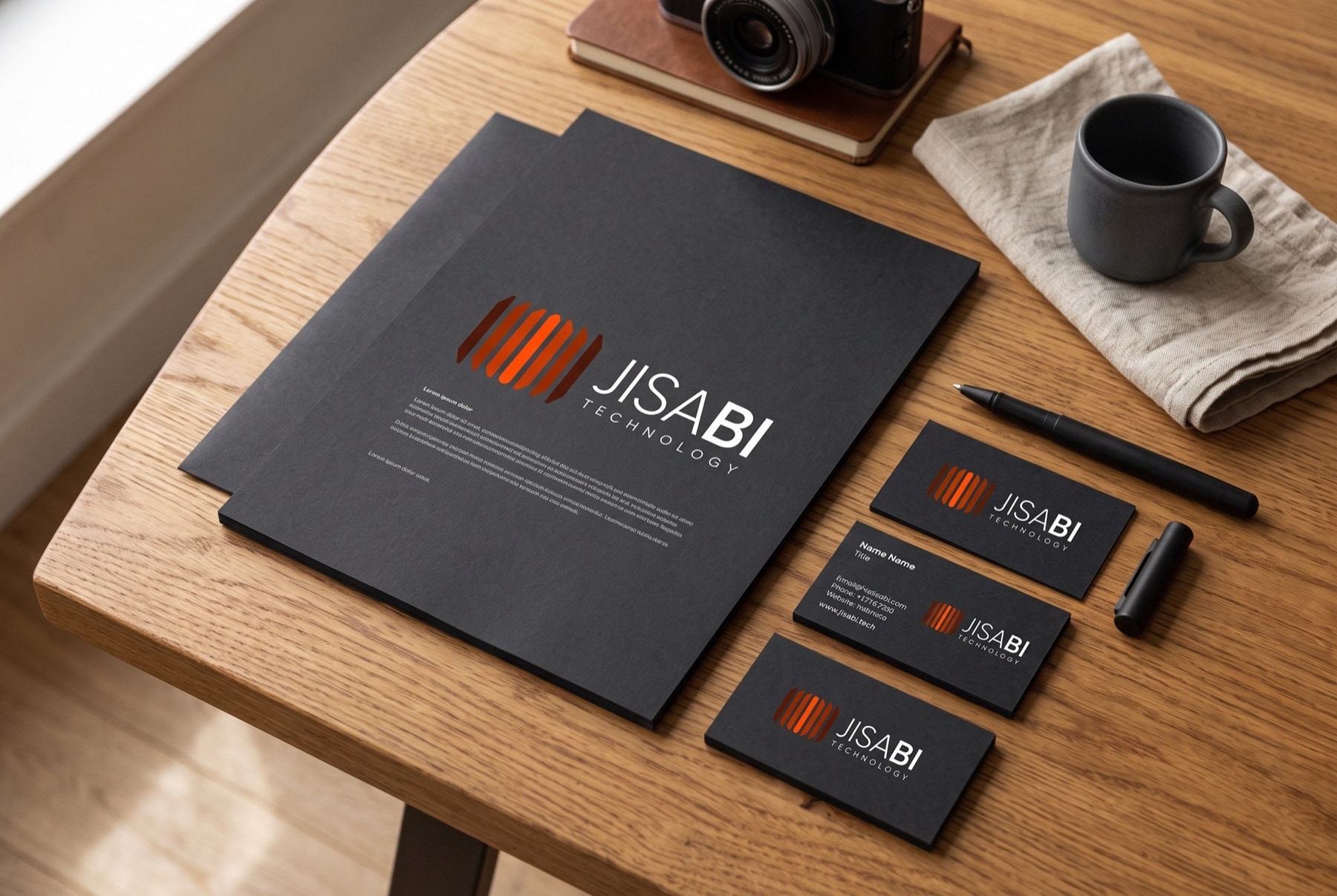
The system was proven off-screen before it was called done. Carbon stationery, dimensional signage, an enamel pin and an app icon each stress a different property, contrast, geometry, scale, and the identity holds because it is a system, not a styled screen.
04Framer website
A site that makes advanced tech legible
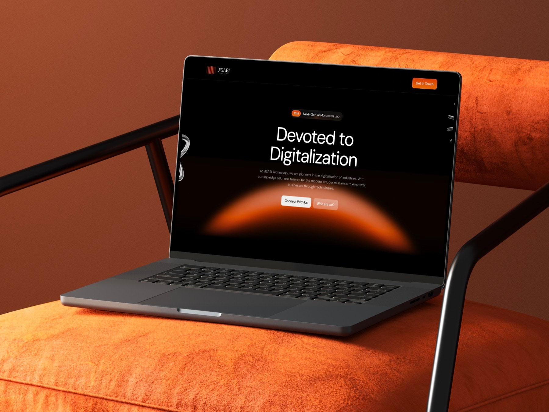
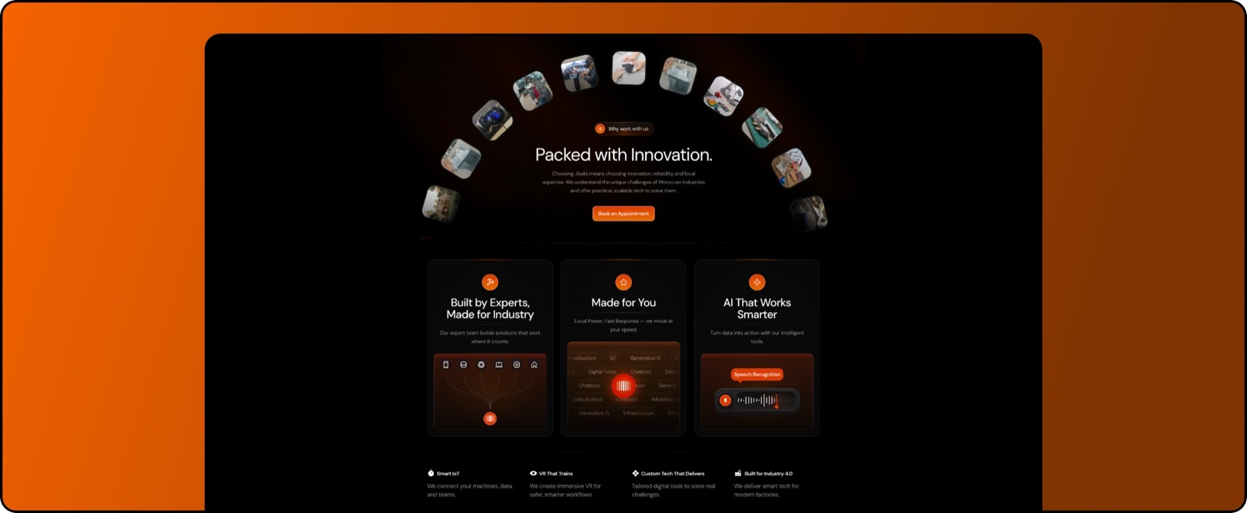
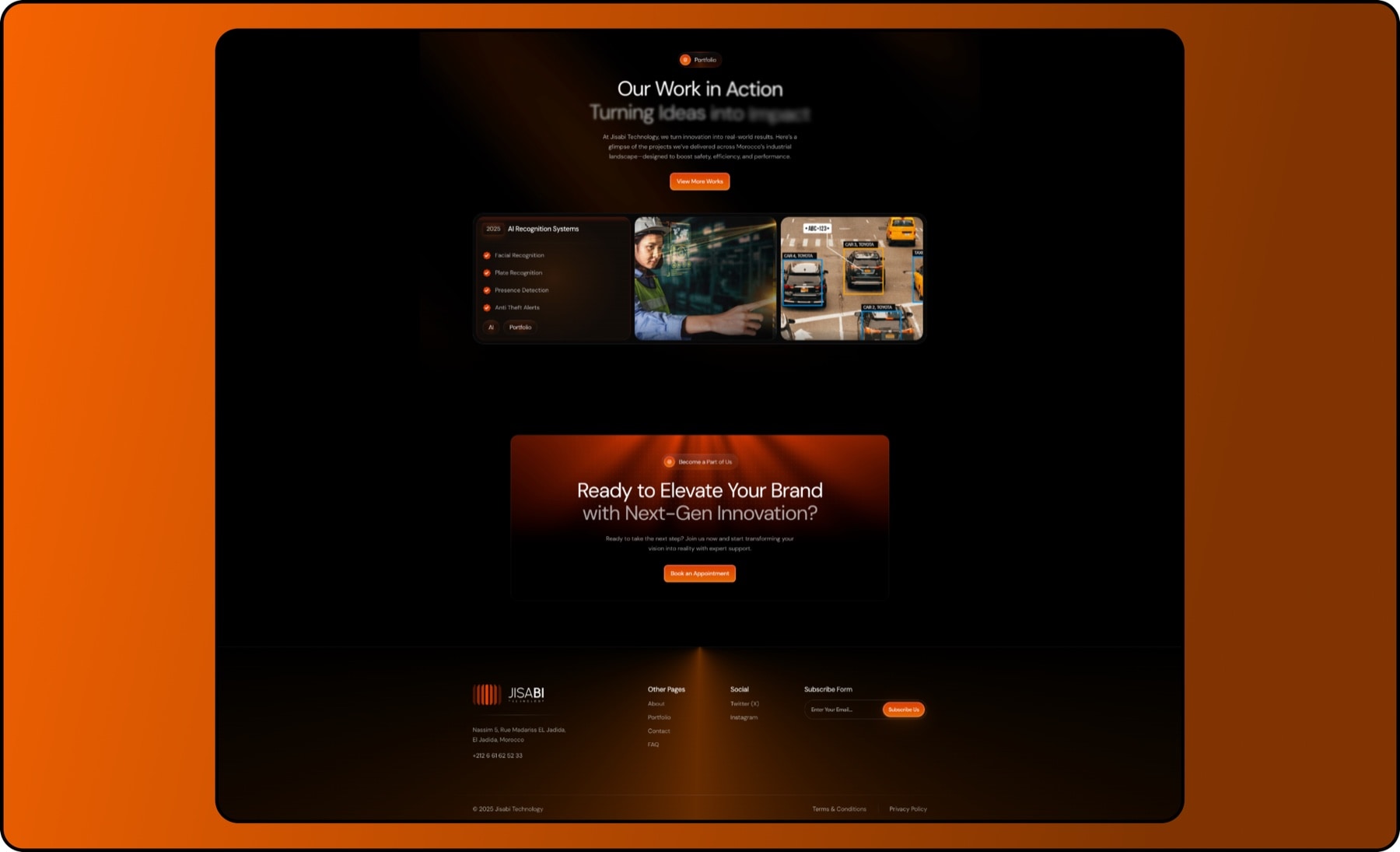
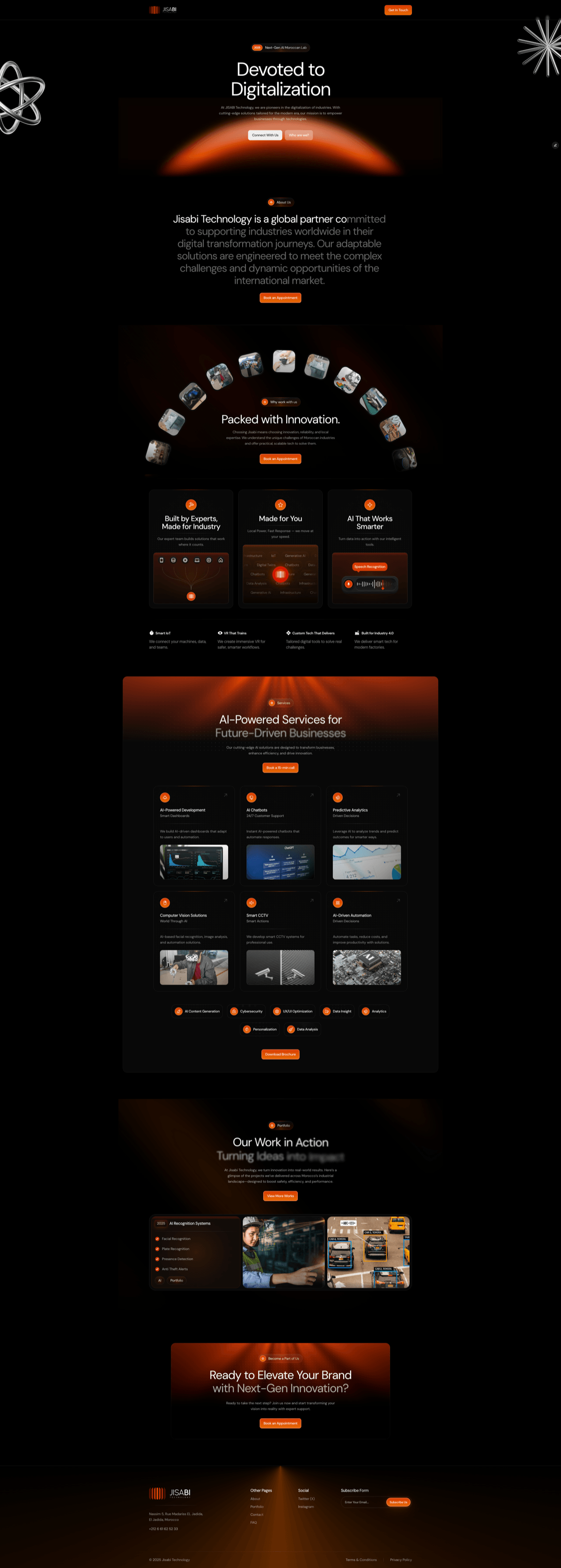
The site has one job: make a dense technical offer feel effortless and credible. Built entirely in Framer, it applies the ordering decision from discovery: each capability leads with what it makes possible operationally, and the technical specifics follow for the visitors who want them.
Smooth transitions and dynamic interactions guide attention, and a restrained futuristic register signals advanced technology without tipping into gimmick.
- Navigation · Wordmark, section anchors and a persistent Contact CTA.
- Hero · The core promise plus a live dashboard preview of the platform.
- Services · AI dashboards, predictive analytics, IoT, digital twins and automation, framed by outcome.
- How it works · From connected data to insight to automated action, in three steps.
- Why JISABI · The operational value: efficiency, uptime and smarter decisions.
- About · A Moroccan technology company built for Industry 4.0.
- Contact · A short form to start a conversation.
- Footer CTA · A last call to request a demo.
05Reflection
A brand and site that match the technology
JISABI now has a complete, ownable presence: a mark with a meaning, an identity system that holds from an enamel pin to a storefront, and a fast, responsive website that finally matches the sophistication of the technology, across desktop and mobile.
The lesson I keep: for a technical brand, restraint is not the absence of ambition, it is the proof of it. Every place the identity declined a futuristic flourish is a place an industrial buyer’s trust survived.