Même Pas ClapUI/UXBrandingFramer2026
MÊME PAS CLAP
Brand identity and website for a visual-storytelling production company.
Même Pas Clap is a creative production company built on visual storytelling. It needed a cohesive digital presence: a brand and a website able to showcase its productions and creative projects through an immersive, visually engaging experience.
01
The Problem
A production company is judged on the strength of what it makes. Même Pas Clap needed a digital home that could carry its productions with the same craft as the work itself, not a generic template that flattens everything to a grid of thumbnails.
The brand had to work in two registers at once: a distinct visual identity, and a website immersive enough to do the storytelling justice.
02
The Solution
The work combined brand development (visual identity, colour palette, typography, and artistic direction) with a Framer-built website designed to feel cinematic: responsive layouts, smooth animations, and interactive transitions that let the productions lead.
Every UI decision defers to the content, so the site frames the work rather than competing with it.
Impact
- Identity and site, end to end
- Brand + Web
- Immersive, animated build
- Framer
- A showcase-first experience
- Production
01Discovery
Judged on the strength of the work
A production company is judged on what it makes, which makes its own brand a strange assignment: the identity has to be strong enough to stand for the studio and quiet enough to never compete with a frame of the work. Discovery was mostly about naming that tension and deciding where the brand is allowed to speak.
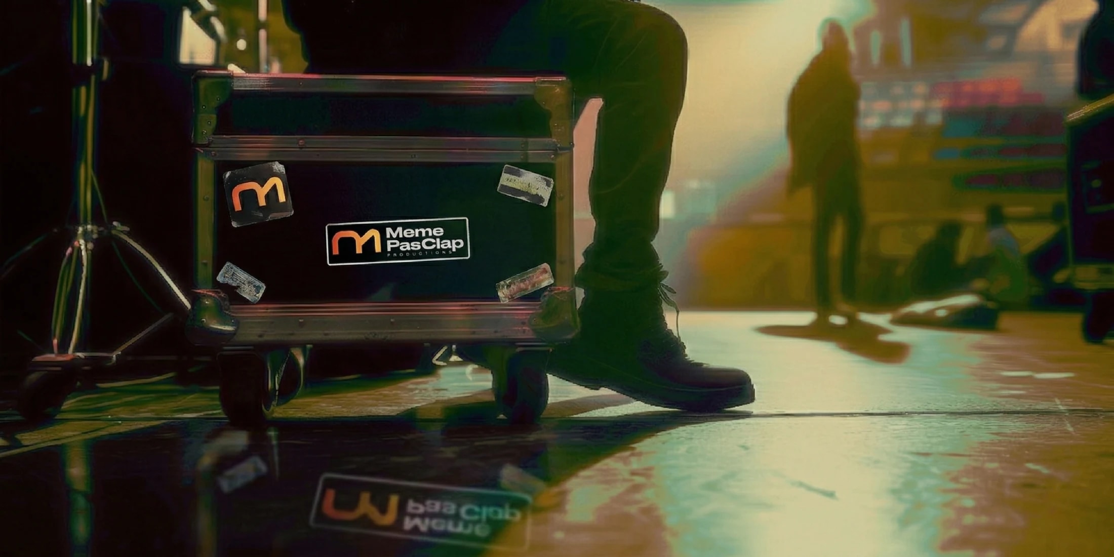
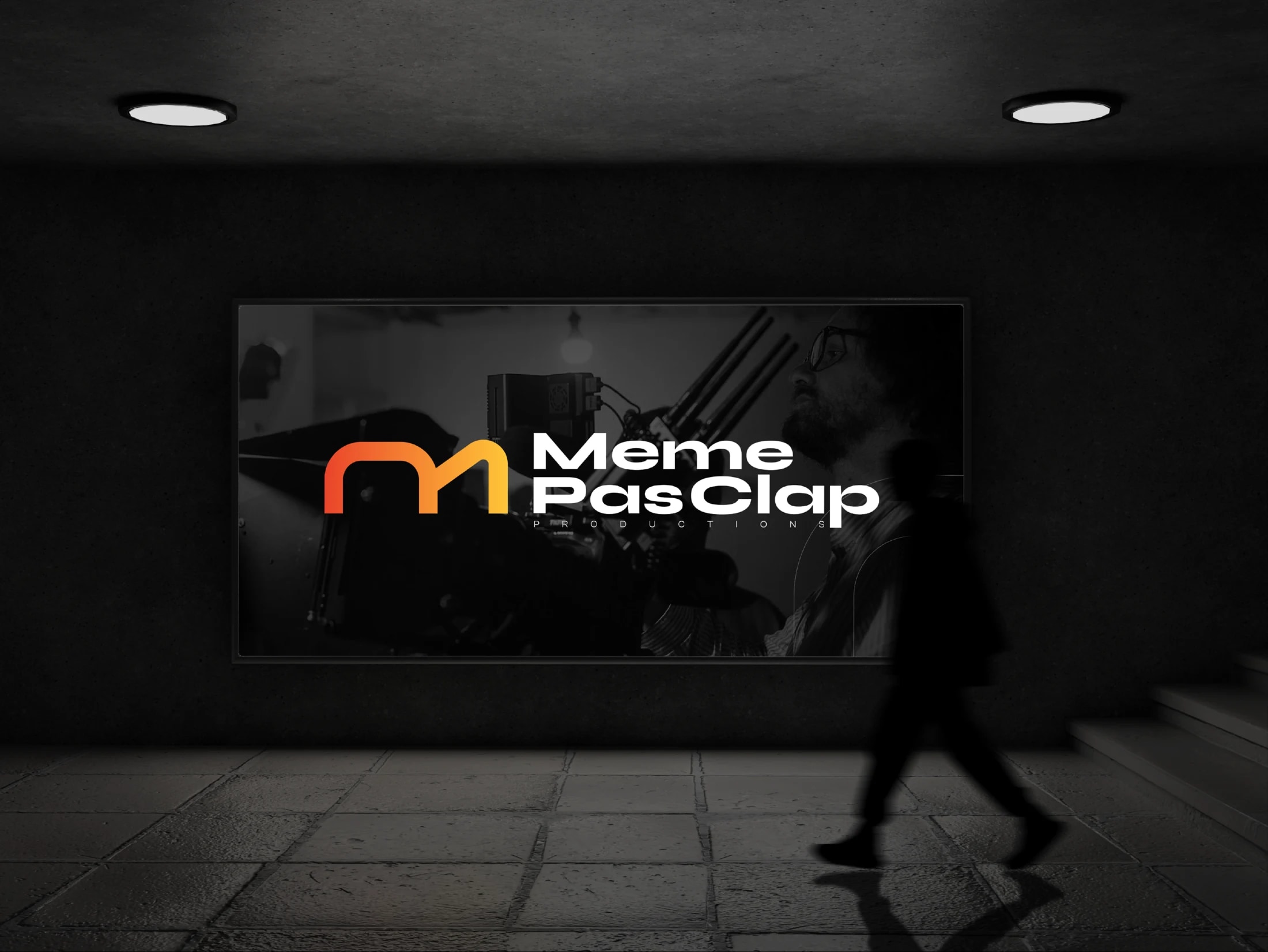
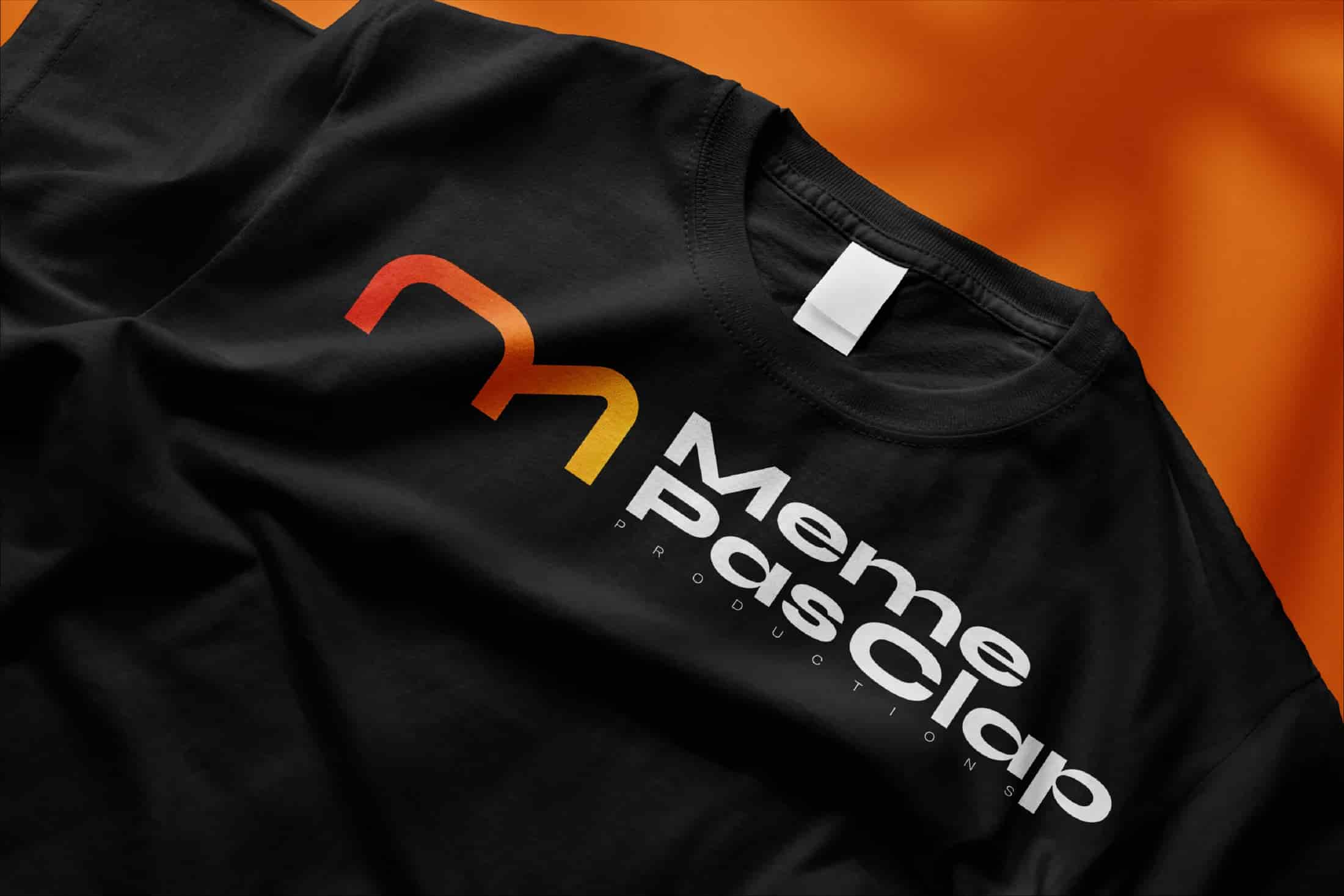
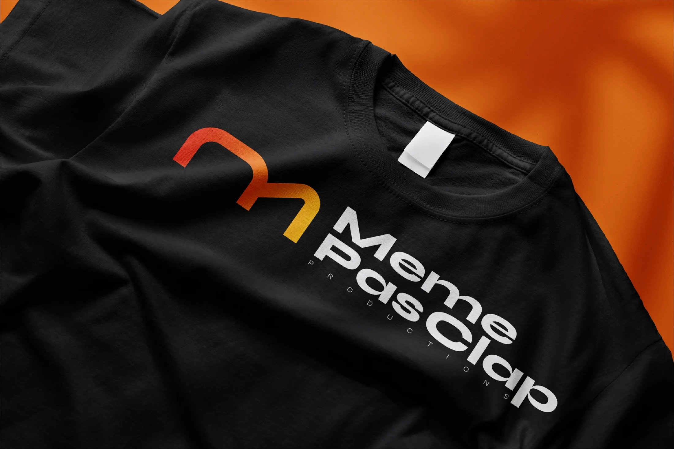
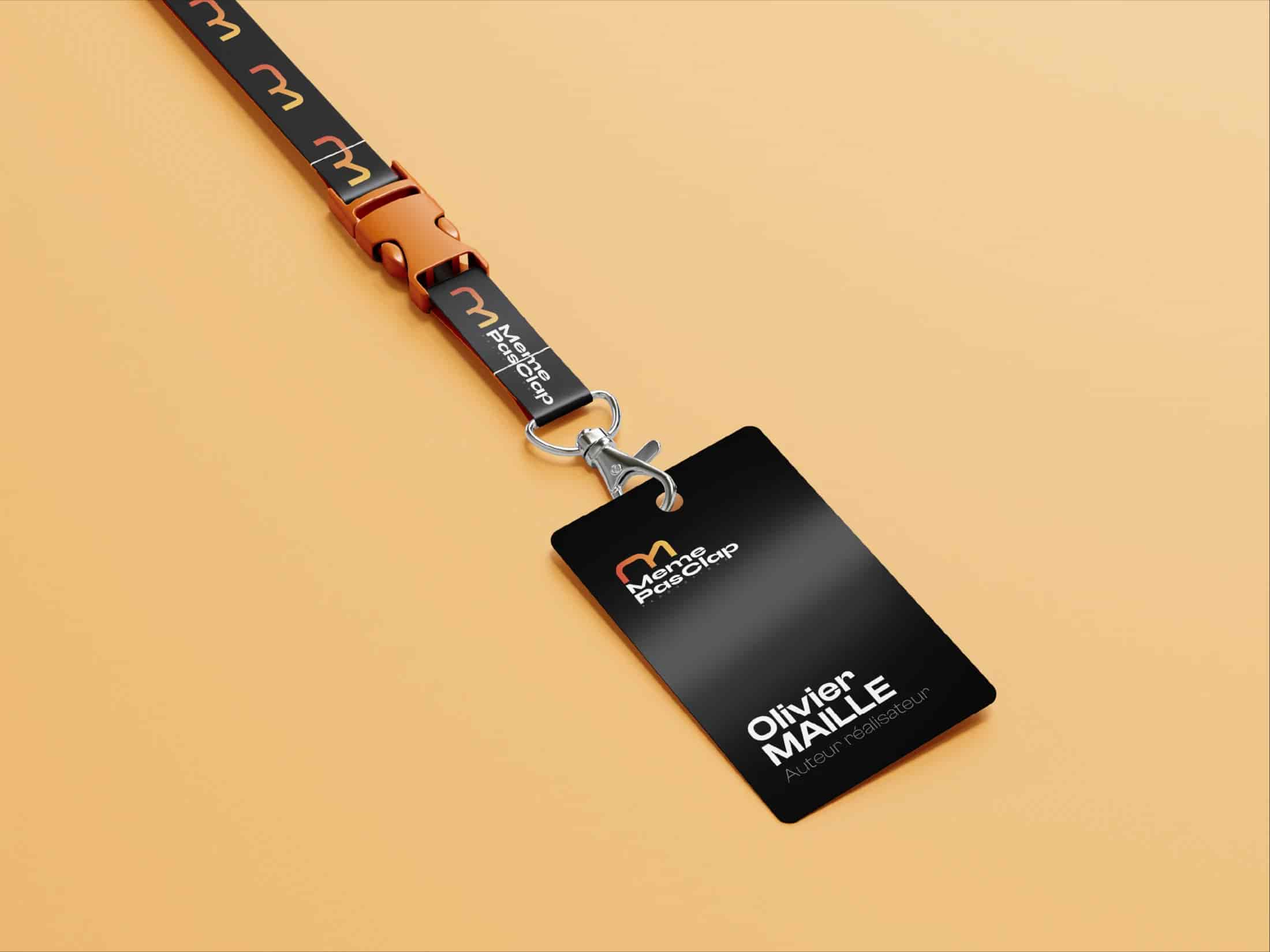
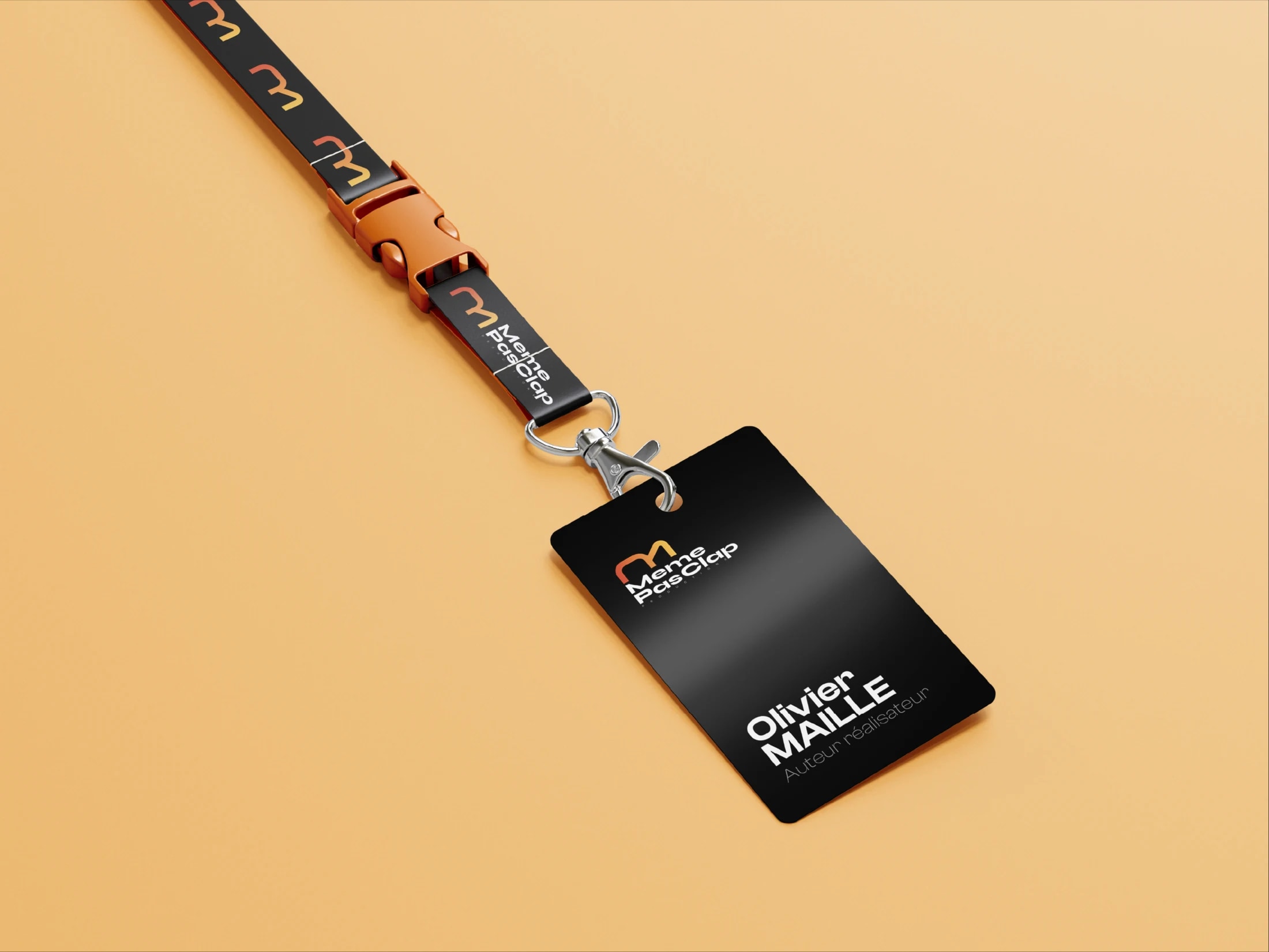
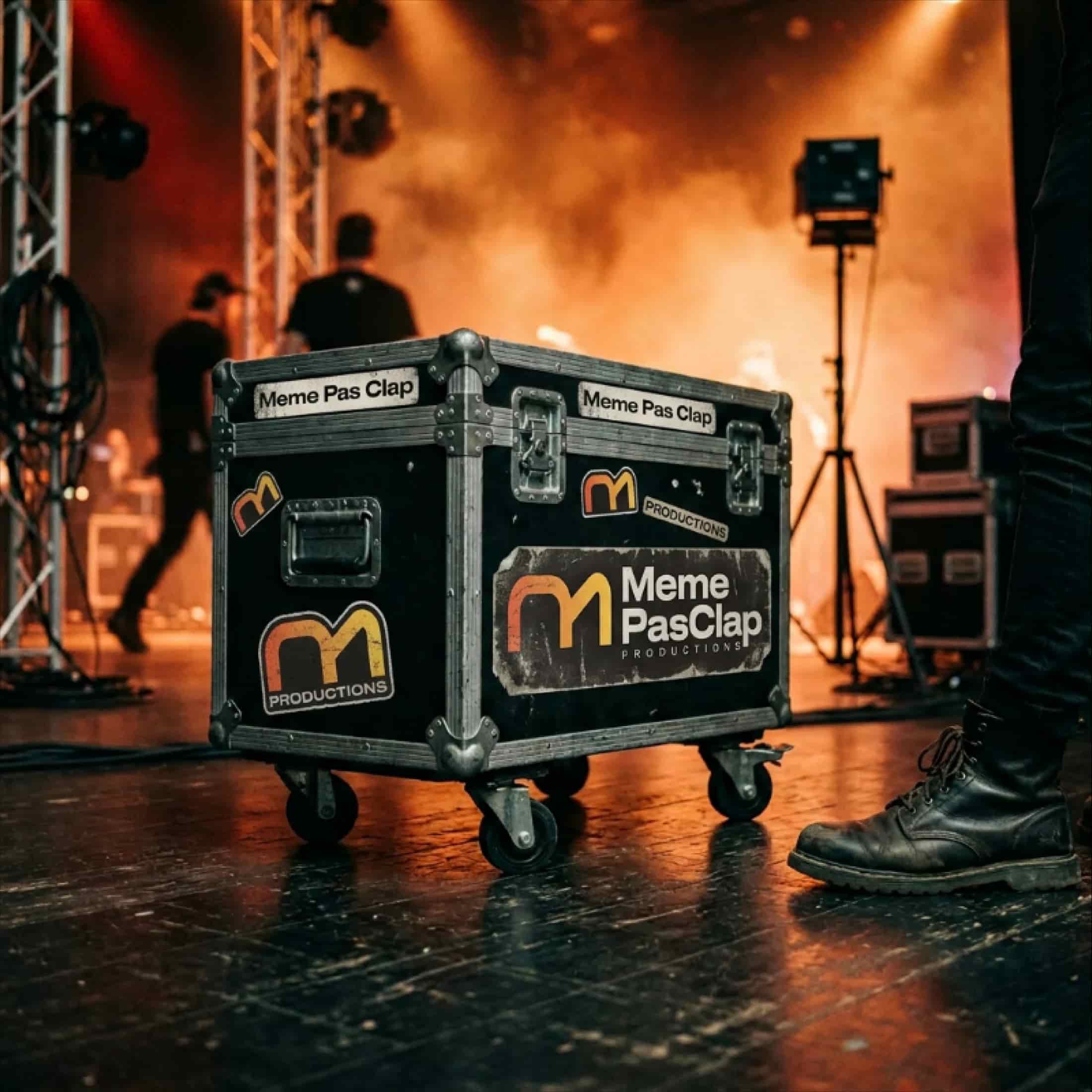
The answer became a rule. The identity leads where the work is absent, on a badge, a flight case, a t-shirt, an empty corridor, and steps back the moment a production is on screen. That rule shaped both the mark and the site around it.
02Exploration
Three routes to the mark
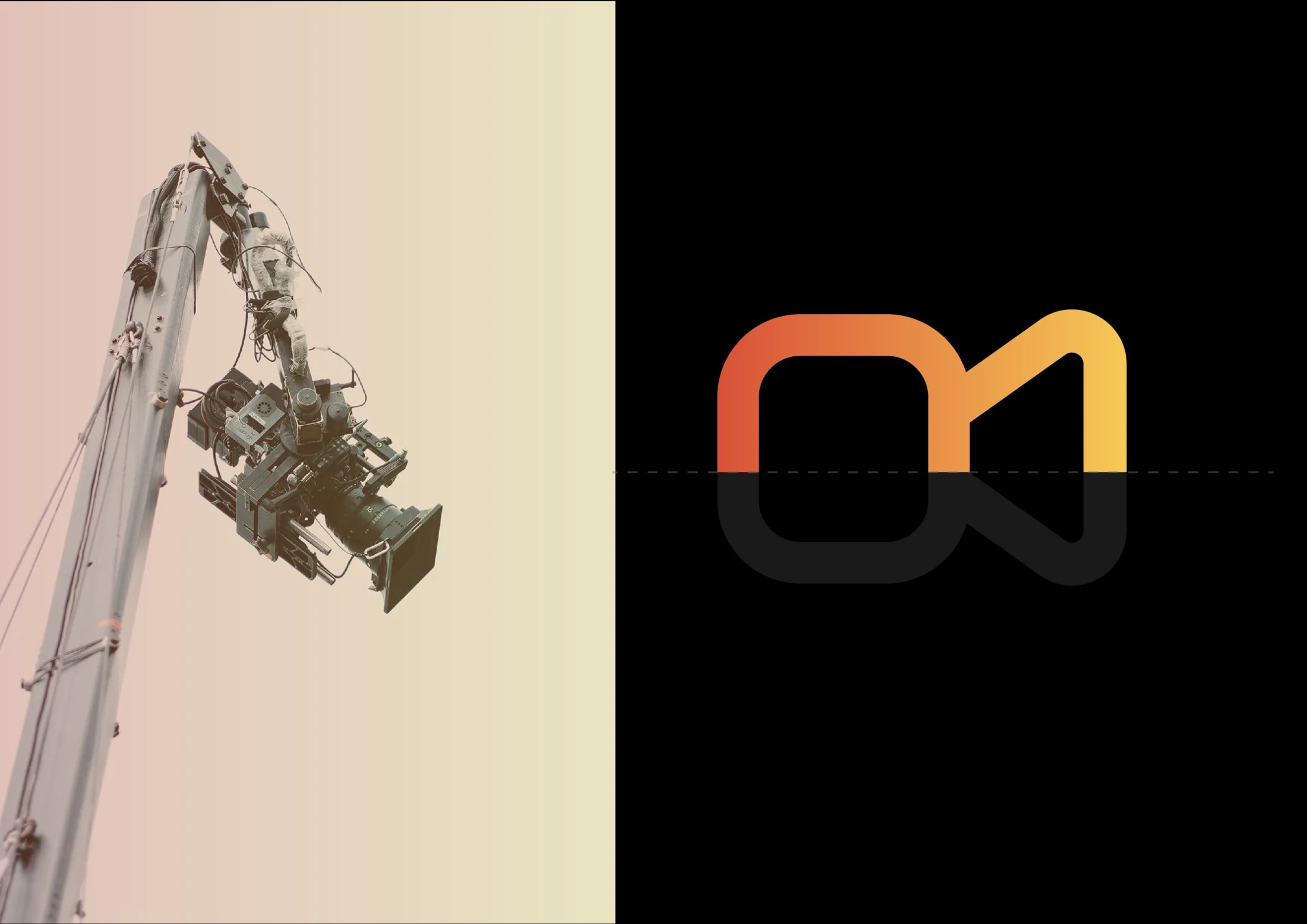
The three classic routes, read against the rule. The literal route, a clapperboard or a camera pictogram, is the sector’s default and disappears into it; every second production company owns one. The letterform route, a drawn monogram, is compact but static, and the one thing a storytelling brand cannot afford is stillness. The route that stuck draws motion itself: two linked loops in one continuous stroke that resolve into an “m” and a film camera at once.
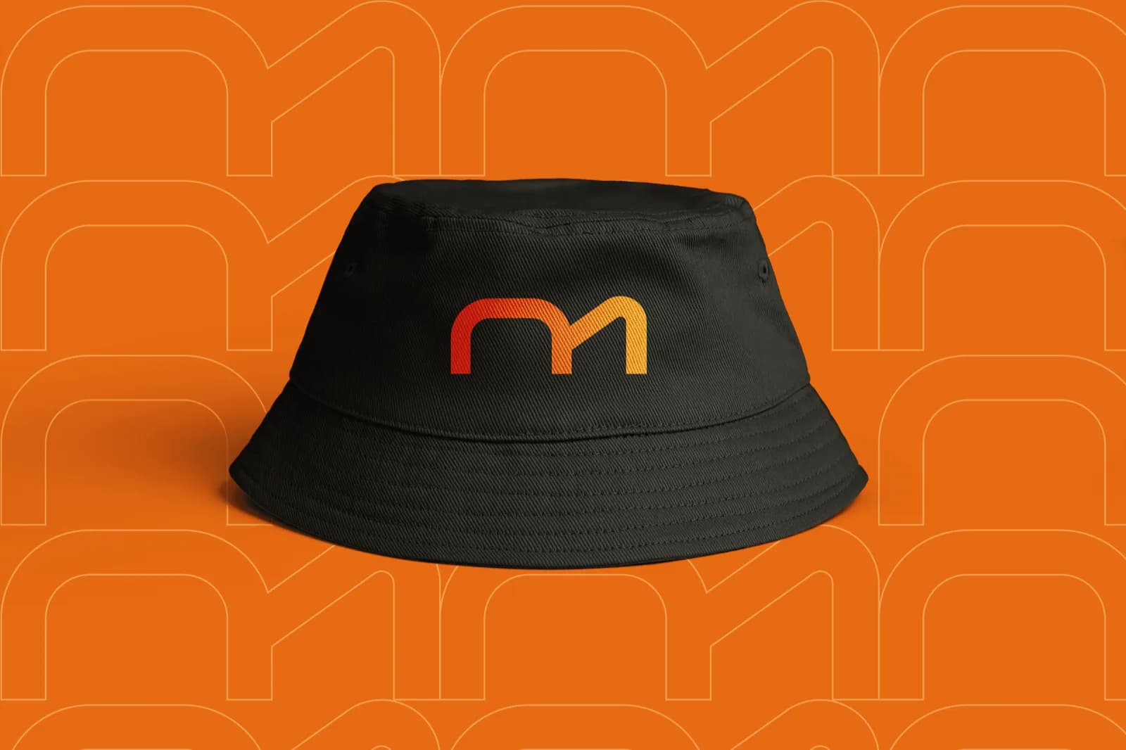
The stroke matters as much as the shape. Because the mark is one unbroken line, it reads as movement, a pan, a dolly, a story that does not cut, and it stays ownable at any size without a single literal illustration. A red-to-amber gradient lights it with the heat of a live set.
- A clapperboard, read instantly
- The default of the whole sector
- Static, for a brand about motion
- Compact and ownable
- Still, where the work moves
- Says the name, not the craft
- One unbroken line, pure motion
- An “m” and a camera at once
- Lit with set-light warmth
03Brand identity
A system made to travel
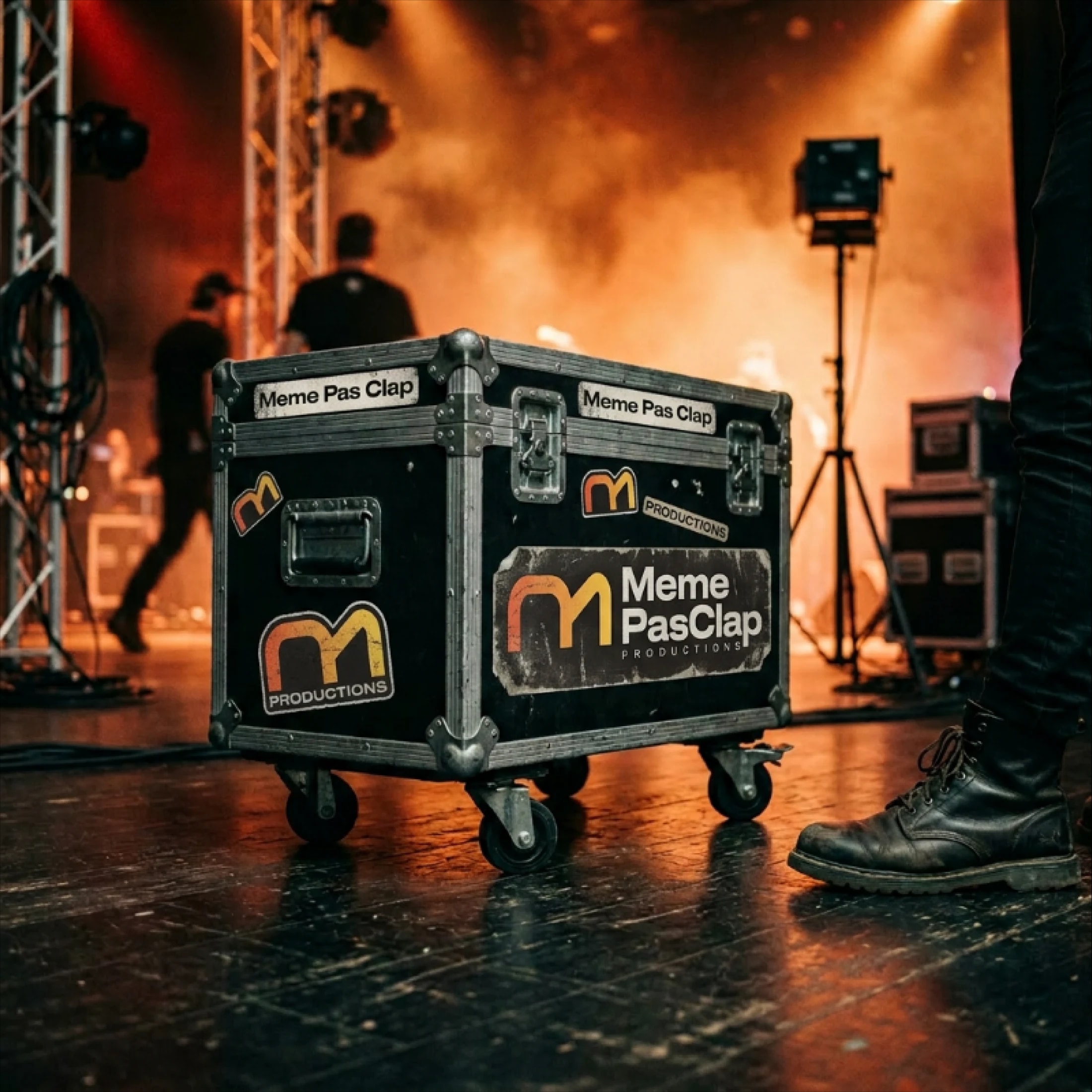
From the mark outward, the system was designed for the places a production company actually lives. Crew apparel, named credentials and battered flight cases each stress a different failure mode, low light, small scale, rough handling, and the identity holds because the gradient and the stroke do the work without the wordmark.
The same register runs the Framer site: responsive layouts, smooth animation and transitions that carry a visitor through the work rather than around it. Every UI decision defers to the content, so the site frames the productions instead of competing with them.
04Reflection
A modern production presence
The finished platform gives Même Pas Clap a professional online presence that represents it as a modern production company: a home for the work that feels as considered as the work itself.
The lesson I keep: for a portfolio-driven brand, restraint is the whole job. The identity earns its place precisely where the work is not, and its success is measured by how gracefully it steps aside.