LeaniosUI/UXSaaSBrandingFramer2023
LEANIOS
Brand identity, SaaS platform, and website: modernised end to end.
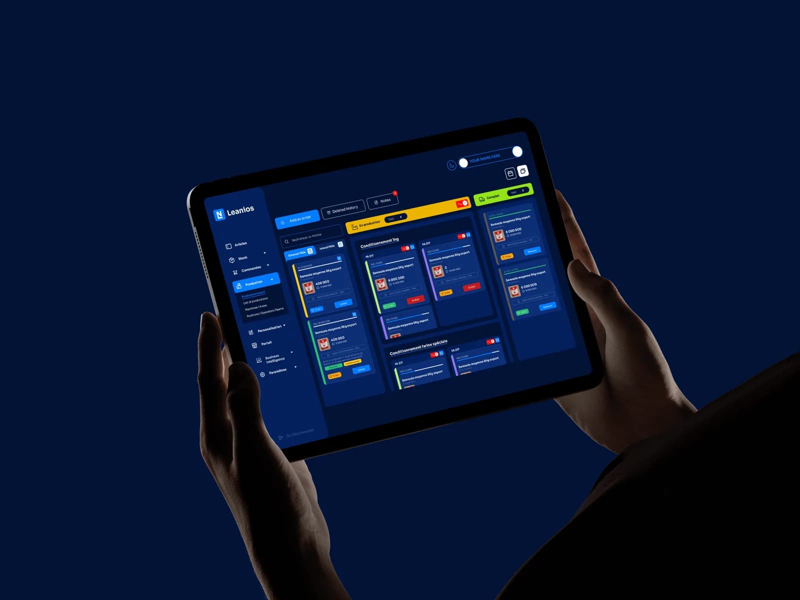
Leanios is a manufacturing execution system (MES) that digitises and monitors production in real time, orders, stock, and shop-floor operations, for the teams that run a factory. It needed to modernise across the board, its visual identity, the SaaS platform, and the marketing website, so the product would finally read as capable as the technology behind it.
01
The Problem
Leanios had outgrown its identity. The brand, the MES interface, and the website had drifted apart, and a platform that runs real production for manufacturers read as less capable than it actually was, the most expensive kind of undersell.
The redesign had to hold three surfaces together at once, brand, product, and marketing site, without letting any of them pull in a different direction.
02
The Solution
I ran one redesign across the logo, the SaaS platform, and the website. The identity was modernised into a single mark and palette; the MES interface was reworked around clearer navigation, an accessibility baseline, and a calmer, denser production view; and the site was rebuilt in Framer with structured, responsive layouts.
One system now spans all three surfaces, so Leanios reads as a single, coherent product company, from an app icon to a shop-floor dashboard.
Impact
- Redesigned end to end
- Brand + SaaS + Web
- A clearer production view
- Real-time MES
- Consistent across devices
- Responsive
01Discovery
Three surfaces, drifting apart
Leanios had outgrown its identity, and the symptom was drift: the logo said one era, the SaaS interface another, the website a third. Each surface had been improved locally and honestly; nobody had owned the whole. The product experience read as less capable than the technology behind it, which is the most expensive kind of undersell.
The diagnosis mattered because it changed the assignment. This was not a restyling job on three deliverables; it was one system to be designed once and applied three times, so no surface could drift again without the others noticing.
02Framing
One system, three surfaces
The redesign treated brand, MES interface, and website as one problem rather than three projects. The modernised identity set the foundations, tokens the other surfaces inherit rather than imitate: the product UI was rebuilt around clearer navigation, an accessibility baseline, and a calmer interface, and the marketing site was restructured for clarity and responsiveness.
Holding all three to a single language is what turned a scattered presence into a coherent one: the same system reads as brand on the site and as usability in the product.
- Modernised logo
- Palette and type
- Voice and assets
- Clearer navigation
- Accessibility baseline
- Calmer interface
- Structured layouts
- Responsive build
- One story
03Brand system
One mark, built to travel
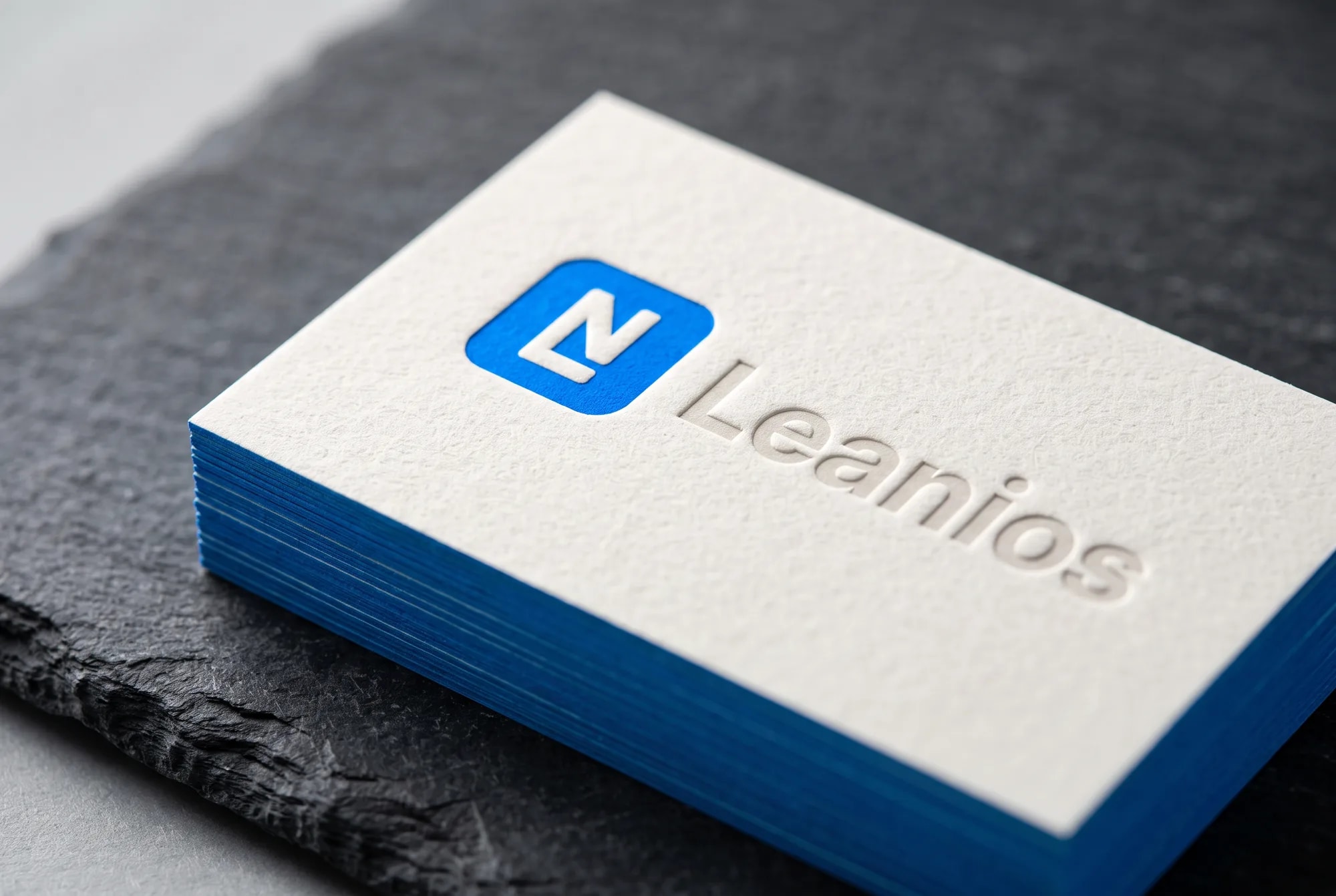
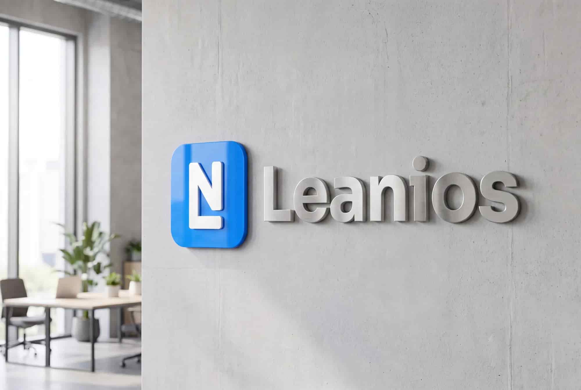
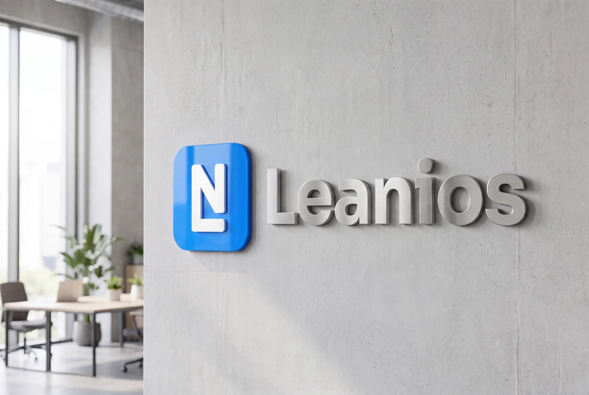
The identity is deliberately spare: an LN monogram in a rounded tile, one confident blue, and a deep navy for the product’s dark surfaces. The mark locks an L and an N together so the company initial reads at favicon size, and its rising diagonal doubles as a quiet arrow, production pushed forward.
Restraint is the whole strategy. One mark and one colour, pressed into thick letterpress cards and cut into brushed-steel office signage, say more about a serious technology company than any amount of decoration. And the same tokens that carry the brand carry straight into the product.
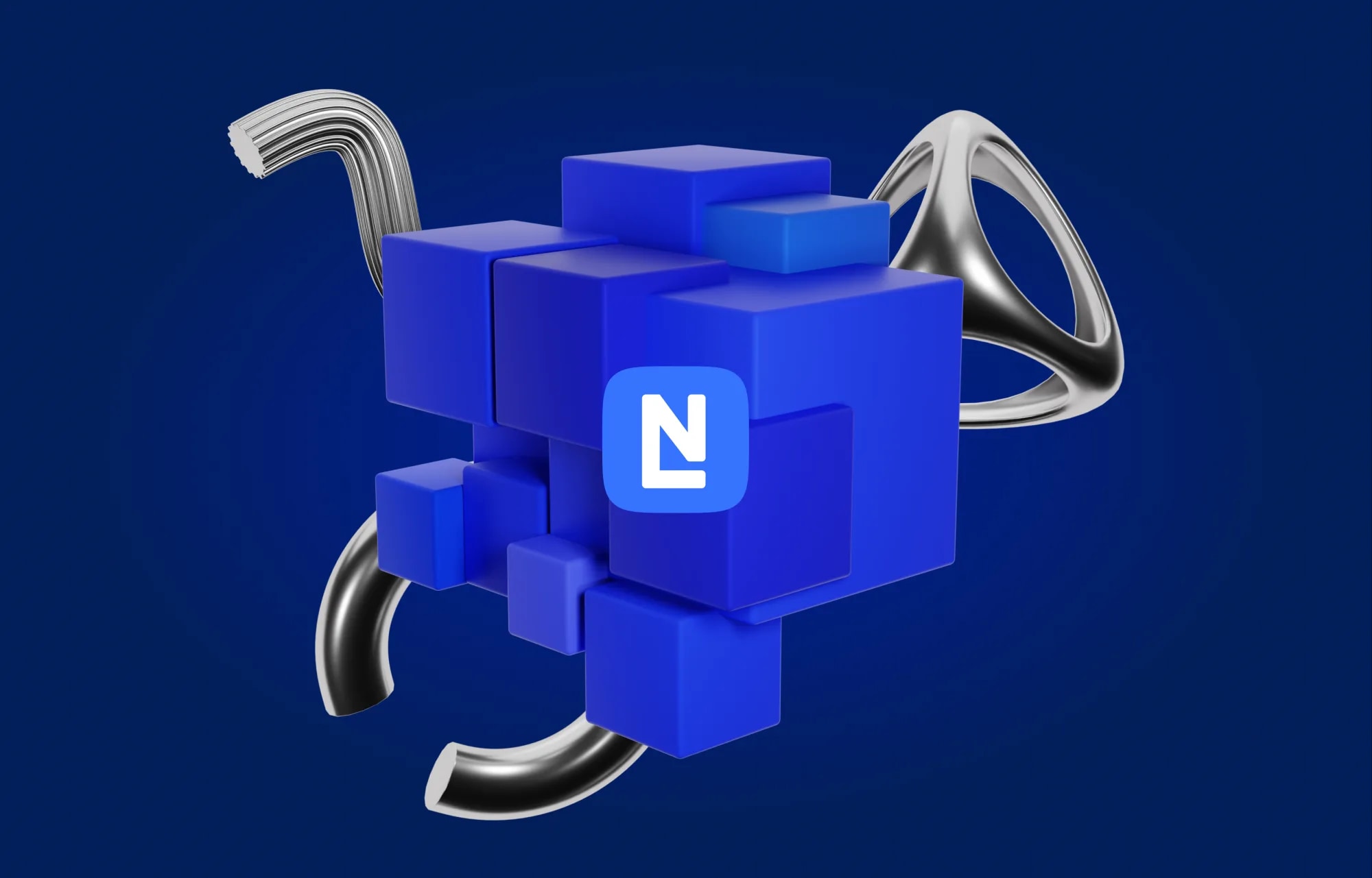
- Two letters, one markAn L and an N share strokes inside a single monogram, so the company initial reads at favicon size and the wordmark keeps its rhythm.
- Built on a rounded tileThe mark sits in a rounded app tile, so it drops straight onto a favicon, a sidebar and a phone home screen without redrawing.
- A rising diagonalThe N’s upstroke doubles as a quiet upward arrow, a nod to a platform built to push production forward in real time.

04SaaS platform
The daily surface, made legible
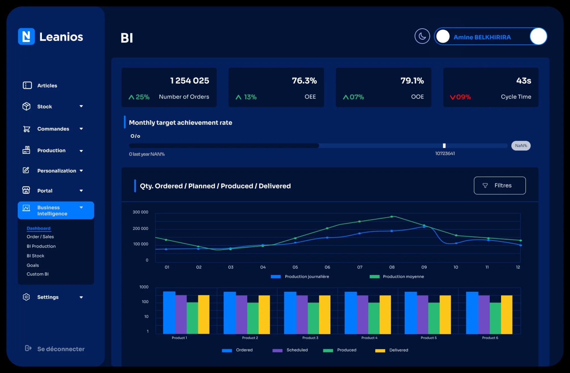
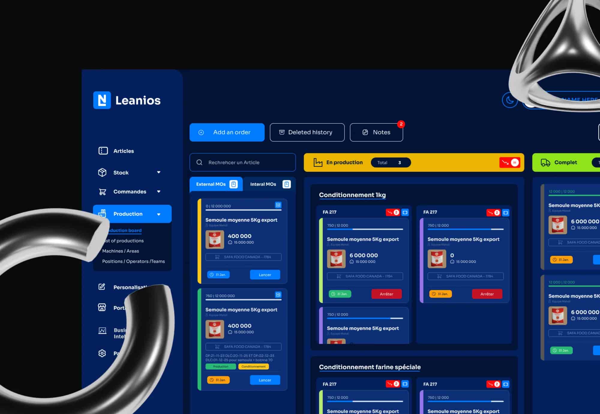
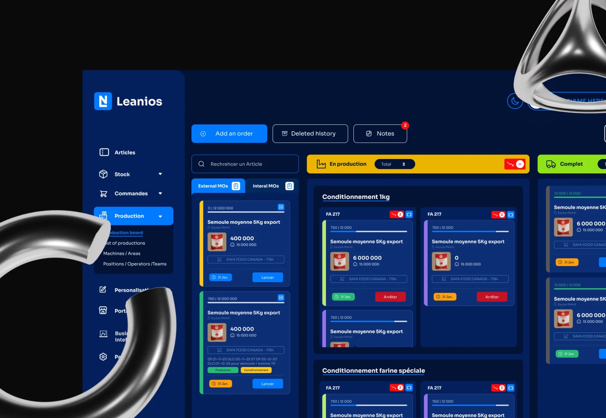
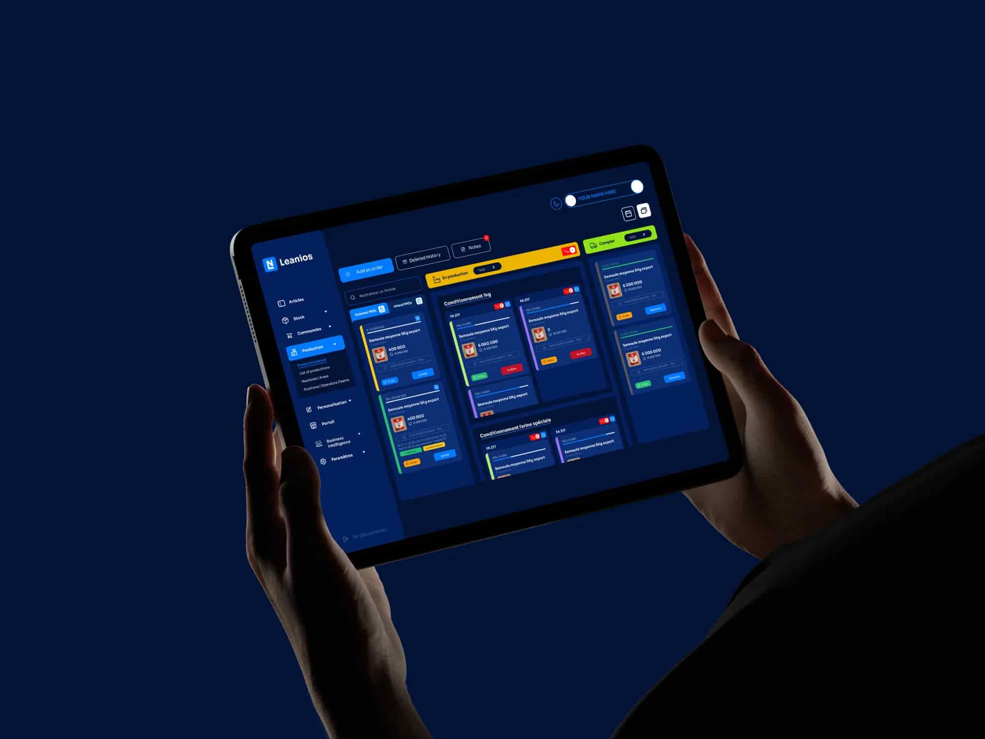
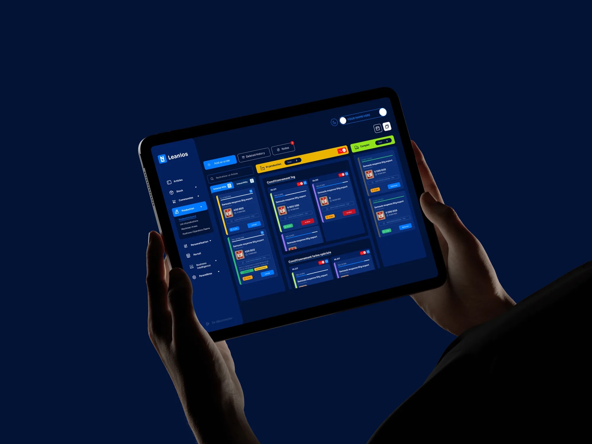
The MES is where Leanios lives every day: manufacturing orders, stock, machines and teams, tracked in real time on a dark, dense production view. The redesign kept the density, an operator needs to see a lot at once, but gave it structure: a calm sidebar, a clear status colour language, and cards that read at a glance under shop-floor conditions.
On top of the operational board sits a BI layer, OEE, cycle time, ordered against produced, so the same platform serves the operator running the line and the manager reading the numbers. Green means done, amber means running, and the hierarchy holds whether it is on a wall display or a tablet in someone’s hands.
05Website
A public face that matches the product
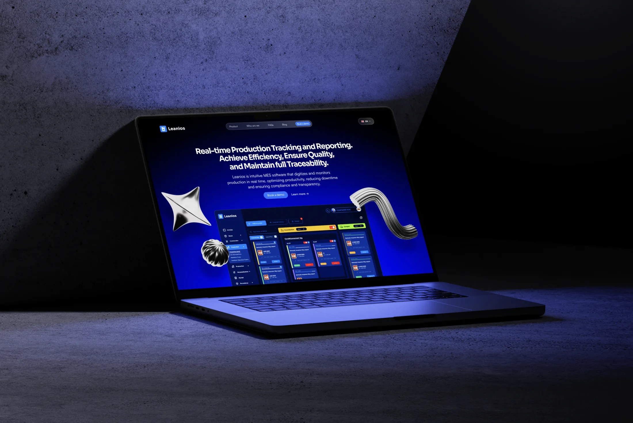
The marketing site had one job: make a serious platform feel as capable as it is, in the ten seconds before a visitor books a demo. It was rebuilt in Framer around a single story, real-time production tracking, with the actual product shown in-frame rather than described, then structured layouts that carry a visitor from the promise to the proof to the call to action.
Responsive behaviour and smooth motion do the finishing: the same identity, palette and type run from the hero to the footer, so the site reads as the front door of the product, not a separate brochure.
- Hero · Real-time production tracking, the product shown in-frame
- Product · What the MES does: orders, stock, production, BI
- Who we are · The company and team behind Leanios
- FAQs · Objections answered before the demo
- Blog · Notes on manufacturing and efficiency
- Book a demo · The single conversion action, repeated
06Reflection
A modernised digital identity
The final result delivered a fully modernised digital identity for Leanios: branding consistency, improved platform usability, and a professional web presence, with a redesigned platform that feels smoother to use and a site that holds up across devices.
What I keep from it: coherence is a process property, not a style. It exists because one system was designed once and applied everywhere, and it survives only as long as that discipline does.