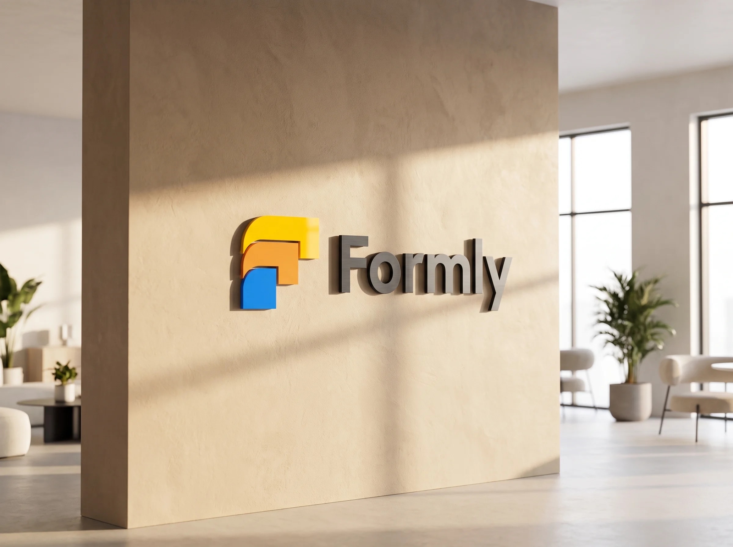
FormlyBranding2024
Formly
A friendly, credible identity for the LMS that runs French training providers end to end: sessions, funding, Qualiopi and the BPF in one place.
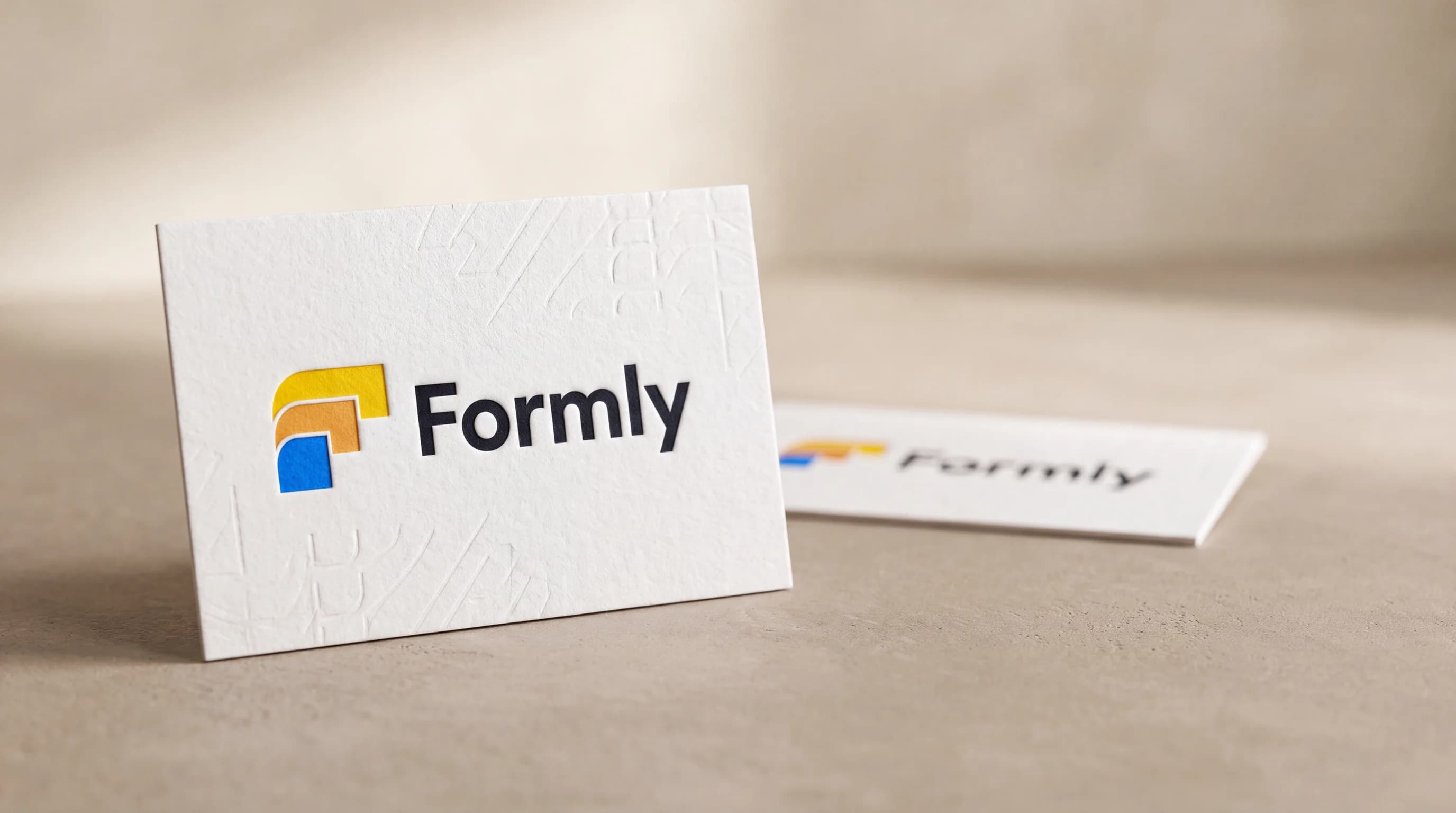
Formly is the operating system for French training organisations. It centralises programmes, sessions, learners, funding, Qualiopi evidence and the BPF in a single platform used by 500+ providers. It needed an identity as approachable as a modern consumer app yet as trustworthy as the compliance it handles. I built the brand from the mark up: a stacked three-tile symbol, a warm-to-cool tri-colour palette, and a geometric type system, designed to carry a dense, regulated product without ever feeling like paperwork.
01
The Problem
Formly does something unglamorous and hard. It turns the paperwork of running a French training body, the attendance sheets, funding files, Qualiopi audits and the annual BPF, into one calm platform. Its identity did not say that. A product 500+ providers open every day needed a face trustworthy enough for an auditor and light enough for daily use.
The brief pulled two ways. Too corporate and it reads as yet another compliance tool nobody enjoys; too playful and it undercuts the trust a platform handling funding and audits has to earn. The identity had to hold both at once.
02
The Solution
I built the identity from a single idea: everything Formly does, programmes, sessions, funding and evidence, stacks into one place. The mark is three rounded tiles cascading into a built “F”, and a warm-to-cool palette runs from a sunray yellow through marigold to a confident Formly blue.
Around the mark sits a bright, calm system: an Urbanist type scale, generous white space, and colour used with a job. It reads as a modern SaaS a provider is glad to open, while the blue does the serious work of pointing to every action.
Impact
- Training bodies running on the brand daily
- 500+ providers
- Mark, palette and type system
- End-to-end
- Yellow to marigold to Formly blue
- Tri-colour
01Discovery
Trusted by an auditor, opened without a sigh
Formly runs the unglamorous machinery of French professional training: attendance sheets, funding files, Qualiopi evidence, the annual BPF. Discovery was about the emotional register of that work. The people who open Formly every day do not love the paperwork; they love being done with it. And behind them stands an auditor who has to trust every number the platform produces.
That defined the brief’s two-way pull precisely. Too corporate, and Formly reads as one more compliance tool nobody enjoys; too playful, and it undercuts the trust a platform handling funding and audits has to earn. The identity had to hold both registers at once, which ruled out every off-the-shelf SaaS look.
02Exploration
Three routes to the mark
The three classic routes, tested against the one idea. The literal route, a graduation cap, a certificate, a folder, says training and looks like every LMS of the last decade. The letterform route, a drawn F, is clean but empty: it says the name, not the promise. The route that survived builds the promise itself: three rounded tiles, programmes, sessions, evidence, cascading into a built F.
The stacked mark does double duty. Read as shapes, it is everything Formly gathers, stacking into one place; read as a letter, it is the name. And the cascade steps down and outward, so it reads as a sequence unfolding, a path, a session, an onboarding, rather than a static pile.
- A cap or certificate, read instantly
- Looks like every LMS of the decade
- Says the sector, not the promise
- Clean and compact
- Says the name, not the idea
- Interchangeable with any F brand
- Everything Formly runs, gathered
- Resolves into a built F
- A cascade that reads as progress
- Three stacked tilesThe mark is three rounded corner-tiles, a crown, a middle and a base, each a quarter-turn of the same shape, gathering everything Formly runs into one place.
- One shared radiusEvery outer corner is cut to the same generous radius, so the three tiles read as one family rather than three separate blocks.
- A cascade, not a pileThe tiles step down and outward to the left, so the mark reads as a sequence unfolding, a path, a session, an onboarding, not a static stack.


03Brand system
Warm to earn trust, blue to act
The palette runs warm-to-cool across the mark itself: a sunray yellow crown through marigold to a confident Formly blue, so the symbol carries approachability and authority in one gradient of intent. Around it, the system stays bright and deliberately calm: an Urbanist type scale, generous white space, and colour used with a job.
The discipline is in the blue. It is reserved for action alone, buttons, links, active states, so a provider working through a dense funding file always knows where to look. The warmth lives in the brand moments; the blue does the serious work.
abcdefghijklmnopqrstuvwxyz 0123456789 & @ %
04Reflection
A brand as usable as the product
Formly now has an identity that matches what it is: a serious platform that feels light to use. One stacked mark, a warm-to-cool palette and a single geometric voice carry it from an app icon to an audit-ready export, approachable enough for daily use and credible enough for the paperwork it handles.
The lesson I keep is that friendly-versus-credible is a false choice; it only looks like one before the system exists. Structure carries the credibility, the shared radius, the spacing, one disciplined blue, which frees the surface to be warm. The auditor and the morning user read the same brand, and each finds what they came for.